• About
  • WHITEBOARD
  • Archive
  • Contact
Menu

widgets & stone | Graphic Design and Branding Agency in Chattanooga, TN

  • About
  • WHITEBOARD
  • Archive
  • Contact

PEF 2020 Annual report

October 10, 2020

Bright Spots for our Schools

PEF 2020 Annual report

PEF is an independent, nonprofit, community-based organization that for over twenty‐five years, has provided training, research, and resources to teachers, principals, and schools in Hamilton County and surrounding areas. Their mission is simple: to increase student achievement so all students succeed in learning and in life.

Widgets & Stone worked closely with Dan Challener and the PEF team in providing copy and designing a document that communicates and showcases the unique and important work they do for our city.

Creative Direction: Paul Rustand; Design Direction & Design: Stephanie Fast; Writing: Caleb Ludwick/26 Tools; Photography: Various.

Tags PEF, Public Education Foundation, annual report design, writing, Widgets & Stone

You Dream It, We Build It

December 13, 2019

You dream it, we build it

Stribling & Company Identity + Web

Strib Stribling is the experienced guide for the unforgettable trip that you didn’t know you needed. Whether it’s fly fishing in Patagonia, hunting for quail in South Georgia, or trekking the Himalayas in Tibet, Strib has the know-how to craft the perfect adventure tailored for you. 

We helped with naming, then created a logo and brand identity for Stribling & Company, along with helping to write and build a one page web site. We can’t wait to hear stories from all the once-in-a-lifetime trips Strib has lined up for next year.

Creative Direction: Paul Rustand; Design Direction: Liz Tapp; Design: John Le, Stephanie Fast; Writing: Jacob Biba; Photo/Video: Various stock.

https://www.striblingandcompany.com

Tags Widgets & Stone, Stribling & Co., outdoor adventure, web design, logo design, writing, outdoor trips, custom trips, identity design, brand identity

Love at First Sift

October 5, 2018

Graincraft Ad Campaign

Love that’s passed down

Graincraft is America’s largest independent miller of commercial flours. Because the company is made up of three great millers, Grain Craft actually has a 100 year history in the industry.

Widgets & Stone partnered with Grain Craft to develop the look and feel for a new ad campaign. With keen guidance from Grain Craft leadership, the creative team landed on designs and photography that bring their great products into view with contrast and depth.

“Just like a recipe that’s passed down with love from one generation to the other, there’s a shared passion for flour as it’s delivered from the hands of our farmers to our millers, and finally, to our bakers.”

Creative Direction: Paul Rustand; Design Direction: Liz Tapp; Art Direction & Design: Mark Slawson; Writing: Jacob Biba; Photography: Dotson Commercial.

Tags Widgets & Stone, ad design, writing, brand development, Dotson Commercial, jacob biba, flour, ad campaign, print, web, social media

Out of Many, One

June 14, 2017

Out of Many, One

Chattanooga FC 2017 Campaign Theme

For the ninth season, Widgets & Stone helped Chattanooga Football Club craft its campaign theme. Working closely with 26 Tools and the club, the creative team decided to focus on the positive unifying aspects of a city coming together around its team. The concept “Out of Many, One” captures the essence of fans and players uniting around a single goal, and reflects the fact neither is truly fulfilled without the other.

The team developed a wide variety materials for the campaign: posters, calendars, magnets, coasters, social media graphics, videos, ads, billboards and e-blasts.

See a video of the campaign here.

Creative Direction: Paul Rustand; Art Direction: Travis Hitchcock; Design: Matt Greenwell, Mark Slawson, Travis Hitchcock; Writing: 26 Tools; Photography: Ray Soldano; Video Editing: Drake Rustand; Videography: Witt Hullander, Daniel Hamby; Music: Carl Cadwell/Skypunch Studio.

Tags Chattanooga FC, campaign, 2017, Widgets & Stone, design, writing, slogan, soccer marketing

A Billboard That Stands for Something

September 1, 2015

A Billboard That Stands for Something

Billboards for Education Identity

Billboards for Education was created to give hope and support to local educators who struggle with an ever-present lack of classroom resources. As an outdoor advertising company, we use a proven, profitable business model to generate revenues. We then donate 10% of every dollar, from every billboard ad, to local schools. Earning for learning.

Owner and founder Matt Richman realized at the young age of 17 that true greatness is not defined by how much a person has, but how much a person gives. This realization prompted him to change his ultimate professional goal from gaining as much wealth as possible, to positively impacting the lives of as many people as possible.

Already an experienced business owner and entrepreneur, Matt realized the importance of a strong brand identity and writing. He reached out to Caleb Ludwick (26 Tools) and Paul Rustand (Widgets & Stone) to help. Together the team created a set of visual and verbal tools to help Matt establish his new venture and communicate is goals and differentiation points.

Find out more at www.billboardsforeducation.com

Creative Direction: Paul Rustand; Design: Casey Yoshida; Writing: Caleb Ludwick, 26 Tools.

Tags Billboards for Education, Widgets & Stone, 26 tools, design, writing, identity, identity design

A True Beginning

June 11, 2015

Gaining Knowledge. Growing Faith.

A new campaign for Covenant College’s Graduate School of Education

Covenant College believes that our understanding of the world informs and impacts every aspect of our teaching. So Covenant’s Graduate School of Education courses provide a Biblical understanding of education, which becomes the foundation of those in the profession of a teacher or administrator.

Covenant College launched a comprehensive new identity in 2004, but its application to the identity of the Graduate School of Education was not fully executed. For 2015 Widgets & Stone and 26 Tools were engaged to build new messaging for the school. 

The team worked together to create writing and designs that built on the identity of Covenant College, while still creating a sense of differentiation between the undergraduate and graduate programs.

Creative Direction: Paul Rustand; Design: Amy Harmon, Travis Hitchcock, Matt Greenwell; Writing: Caleb Ludwick, Keely Stockett Hungate; Photography: various source provided by Covenant College.

Tags Widgets & Stone, 26 tools, design, advertising, writing, Covenant College, graduate school, brand communications, identity

Change Your Colors

June 10, 2015

Change Your Colors

New look and feel for Aquafil USA

Aquafil was founded more than four decades ago and the Aquafil Group now spans eight countries on three continents, including here in the US as Aquafil USA. 

Aquafil’s polymers and fibers are used in the manufacture of hundreds of products that meet the needs of a wide range of worldwide markets – corporate, industrial, travel, design and home. Aquafil’s sustainable manufacturing processes produce fully regenerable nylon 6 – so every product that comprises one of ours becomes a little more eco-friendly.

In an effort to bring their communications and promotional materials up to date, Brand Communications Coordinator Abby Dayton partnered with Widgets & Stone to create new collateral and advertising.

Mandy Meredith and Caleb Ludwick combined with Dotson Commercial photography to create a series of ads for Aquafil USA.

Art Direction & Design: Mandy Meredith; Writing: Caleb Ludwick; Photography: Dotson Commercial.

Tags Aquafil USA, Widgets & Stone, ad design, writing, print design, Dotson Commercial

The Art of Engineering

April 1, 2015
tumblr_nm54t4v7RG1rxp6kio2_1280.png
tumblr_nm54t4v7RG1rxp6kio5_1280.png
tumblr_nm54t4v7RG1rxp6kio3_1280.png
tumblr_nm54t4v7RG1rxp6kio4_1280.png
tumblr_nm54t4v7RG1rxp6kio6_1280.png
tumblr_nm54t4v7RG1rxp6kio7_1280.png

AdTech

The Art of Engineering

AdTech (Advanced Technology) Ceramics specializes in engineered, mission-critical ceramics for challenging environments. They deliver on complex challenges that other manufacturers avoid, producing the finest quality ceramics in any industry. Shaping them to be stronger, more durable, more precise than what seems possible.

AdTech has a long and rich history in engineering high performance ceramics, but the company’s market share had declined over time. AdTech’s promotional materials and web site were woefully out of date and did not reflect their high tech capabilities accurately.

Widgets & Stone and 26 Tools worked together to craft new brand communications tools. Along with writing headlines and marketing messaging, the team proposed new graphic treatments and photo styles to reflect AdTech’s expertise.

Dotson Commercial photographed the impossibly small and detailed ceramics that the company makes. In order to capture the extreme precision and beauty of these pieces measuring just inches across, Dotson designed a custom lighting solution and used dark and light reflective services to highlight the materials in isolation. Extensive editing and retouching was required to remove some proprietary elements of the ceramics.

The creative team’s work is now providing the basis of a complete web overhaul being designed and built by Tubatomic.

Creative Direction: Mandy Meredith; Design: Mandy Meredith, Kerry O’Connor; Writing: 26 Tools; Photography: Dotson Commercial.

Tags adtech, hi tech ceramics, brand design, writing, messaging, photography, Dotson Commercial, 26 tools, Tubatomic, Widgets & Stone, design

Come As You Are. Get Where You Want To Be.

September 22, 2014

Come As You Are. Get Where You Want To Be.

Forte Fitness Identity Design

After a decade of working for a national franchise, owner and personal trainer Julian Kaufman decided to start his own fitness studio. Through years of working as a one-on-one personal trainer, Julian had developed an excellent client base and reputation. He turned to Widgets & Stone to help him create an identity that would reflect that excellence in his brand communications.

Widgets & Stone worked with regular collaborators Caleb Ludwick and Grant Dotson to create the name, the writing, the designs and the photography to properly represent the new endeavor. Forte Fitness was the result.

The name and overall look and feel were inspired by Julian’s Italian heritage. The name means strong in Italian, and is familiar to those who don’t speak the language. The Italian flag’s colors made their way into the logo and the “azurri” blue of the national teams plays a complimentary role in the palette.

Dotson Commercial is currently working on photographs that show how training and lifestyle go hand in hand at Forte Fitness. The black and white images stand out in the marketplace, but also match well with the colors and type.

Creative Direction: Paul Rustand, Mandy Meredith; Design: Amy Trumbull Harmon, Matt Greenwell, Brian Wleklinski; Writing: Caleb Ludwick; Photography: Dotson Commercial.

Tags Forte Fitness, rebrand, identity, writing, design, logo, Widgets & Stone, 26 Tools, Dotson Commercial

The Love of the Ride, in Gear

September 18, 2014

The Love of the Ride, in Gear

Escadrille’s first catalog

Escadrille is named after a “little squadron” that fought in World War I. They are a challenger brand setting out to make the world’s best apparel for cyclists. They are seeking to bring the form, function and freedom that cyclists want – both on and off the bike.

After initially struggling to find a voice that matched the look and feel of the brand, they turned to Caleb Ludwick (26 Tools) to help write their introduction to the world: the very first catalog. The hitch was — it needed to be done in two weeks.

Widgets & Stone jumped in to help with design, working with photography and product rendering assets to create a functional and memorable catalog. In short order, Mandy Meredith and Paul Rustand helped to produce a small of run of digitally printed catalogs for Escadrille’s first sales trip.

Creative Direction: Mandy Meredith; Design: Mandy Meredith, Paul Rustand; Writing: Caleb Ludwick; Printing: Bennet Graphics.

Tags escadrille, cycling apparel, catalog design, writing, 26 tools, Caleb Ludwick, Mandy Meredith

Streaming Made Simple

August 6, 2014

Streaming Made Simple

Boxcast: Live HD Video, from Anyone to Everyone

Boxcast is a pocket-sized breakthrough technology that makes it simple for anyone, anywhere to stream live video to everyone, everywhere.

Boxcast is a startup with a few years already under its belt. The company’s leadership was finding that the brand identity and communications materials it had created early on weren’t quite doing the job. So a couple of their experienced investors turned to Widgets & Stone for help.

Led by Mandy Meredith and Paul Rustand, the team also pulled in writer and strategist Caleb Ludwick of 26 Tools. The team quickly and efficiently produced several possible solutions for identity and communications, resulting in a clean, clear and straightforward look and feel.

Along with identifying five key target audience archetype stories, and ways to speak to those audiences, Widgets & Stone and 26 Tools created a new logo, design styles, photography guidelines, strap lines, headlines and explanatory copy.

Web designers Alex Ogle and Jason Fritts of Tubatomic joined in to establish web styles and templates for the client to implement.

“I have seen many presentations by nationally renowned creative agencies over the years,” said investor Tobey Maloney, “But this was by far the most impressive. The quantity and quality of concepts delivered on the timeline and budget was spectacular.”

Tags Caleb Ludwick, 26 tools, design, identity, Brand design, writing, BoxCast, rebrand, Widgets & Stone

Engineered for Sport

January 29, 2014
tumblr_niy3am2nr21rxp6kio7_1280.jpg
tumblr_niy3am2nr21rxp6kio3_640.jpg
tumblr_niy3am2nr21rxp6kio5_1280.jpg

Engineered for Sport

Identity Redesign for NGI Sports

NGI Sports provides surface systems for sport, bringing together a legacy of innovation, enduring performance, and stewardship that reduces impact on the environment. All with a relentless commitment to finding the right materials and methods for each project. Engineered for sport, and installed for harder, higher, faster, longer play.

However, NGI’s existing identity and communications design was many years old and was not reflecting the attributes of the company.

Widgets & Stone, 26 Tools and Tubatomic worked together to bring a fresh new look to the company. A complete web redesign is in the works as well.

Creative Direction: Paul Rustand; Design: Bradley Dicharry, Ben Dicks, Nick Turner and Travis Hitchcock. Writing: Caleb Ludwick. Photography: Various found resources for presentation purposes only.

Tags NGI Sports, Widgets & Stone, logo, identity design, writing, Caleb Ludwick, web design, Tubatomic

On the Node

September 17, 2013
View fullsize tumblr_mtabrqnGNb1rxp6kio2_1280.png
View fullsize macbook-air-ipad-mini-office-environment(1).png
View fullsize tumblr_mtabrqnGNb1rxp6kio4_1280.png
View fullsize interior-designer-working-space.png
View fullsize tumblr_mtabrqnGNb1rxp6kio5_1280.png
View fullsize tumblr_mtabrqnGNb1rxp6kio10_1280.jpg

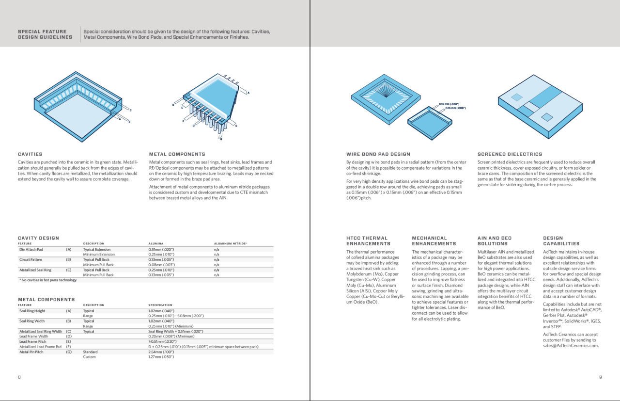
Brand & Communications Strategy

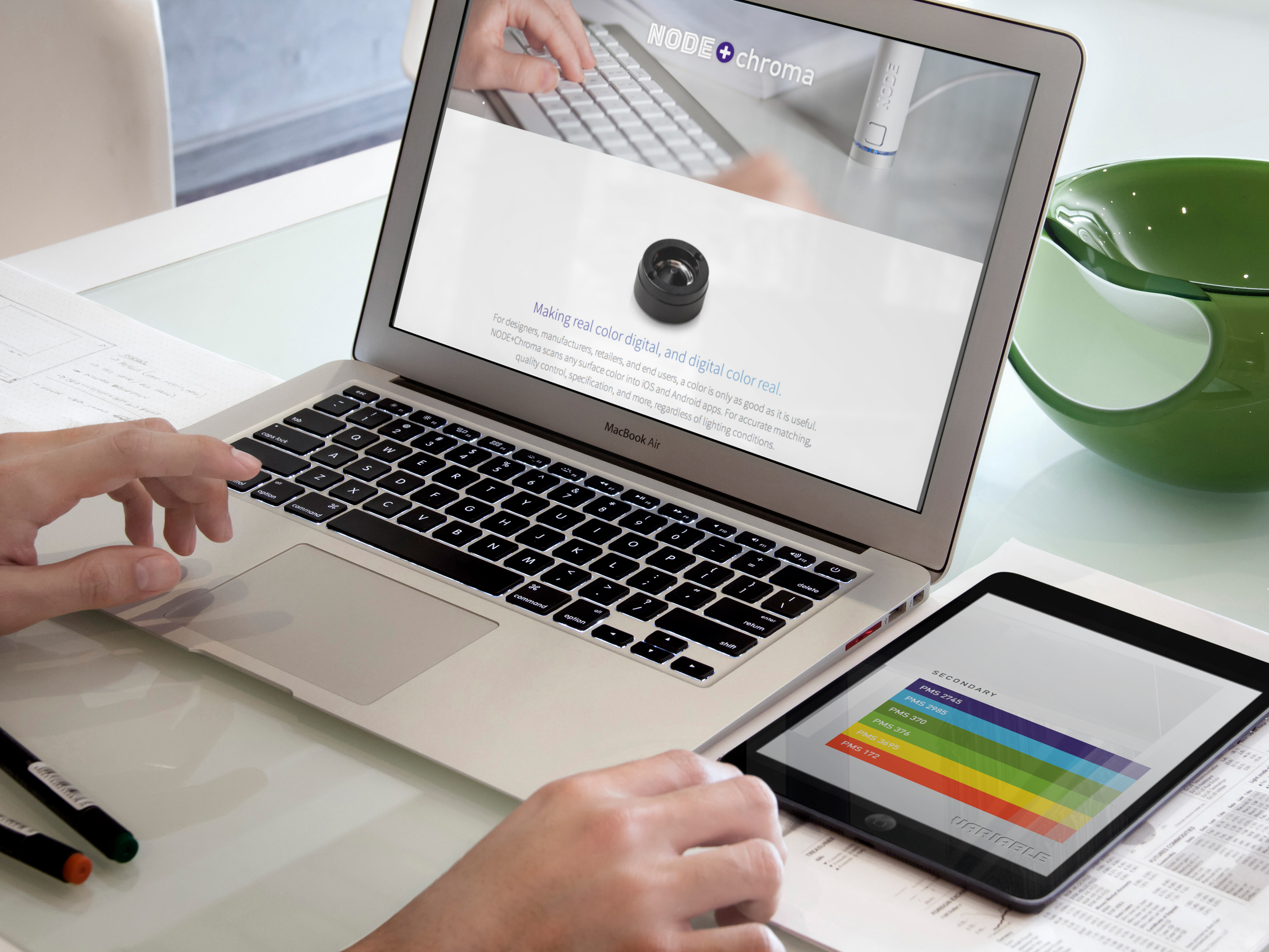
Variable creates platforms that make the real digital, and make the digital real. Variable is also a leading developer of wireless sensing technology, NODE. 

NODE is a Kickstarter success story, turned hardware development company. They are a listening company, a learning company. Experts and innovators. PhDs and MBAs. Users and rethinkers of technology.

NODE’s target market is shifting and expanding, and it is more important than ever that they have a unified and consistent message about who they are, what they do, and why it matters.

Variable’s new CBO Jonathan Bragdon approached the creative partnership of Widgets & Stone, 26 Tools and Tubatomic to help craft a brand and communications strategy for the next phase of the company’s growth.

The team built on the solid identity (created by D+J Brand Consulting) to expand the kit of design and communications tools — with new writing, new photography, a new brand hierarchy and new web tools. Utilizing both broad and narrow strategies: appealing to gadgeteers who can help expand how NODE is used, or to very specific markets in color matching.

“At Variable, we make sensory platforms that connect apps and smart devices to the real world, in new ways. 

NODE is a hardware platform, that transforms how apps let us make sense of the world.” 

Creative Direction: Paul Rustand, Mandy Meredith; Design: Mandy Meredith, Paul Rustand, Brad Dicharry; Communication Strategy/Writing: Caleb Ludwick; Photography: Grant Dotson; Web Design: Tubatomic.

Tags NODE, Variable, Widgets & Stone, Brand Strategy, design, photography, web design, writing, Tubatomic, 26 tools, Caleb Ludwick, Dotson Studios

Rock/Creek Rebrand

July 31, 2007

Rebranding a successful outdoor retailer for a future in the digital marketplace.

Rock/Creek understood that its past is part of its future. Although the logo of 20 years had served them well, it was time for a new identity that would communicate all they are and all they bring to the outdoor experience across multiple brand applications. And one that would help grow into a successful digital presence with online sales.

THE CHALLENGE:
Our challenge was to create a new look and feel for a well established store that not only captured what customers had loved about it for 20 years, but one that would be successful for the next 20 years.

Rock/Creek is committed to taking people into the outdoors. It enables people to move out into the world in new ways, discovering pathless trails and open roads, with all the promise they hold. Rock/Creek helps people to find themselves, get lost in the experience, and find themselves all over again. They do this through great products and great advice.

THE GOAL:
Our goal was to create a new brand identity that would communicate that this is a company that is established, strong and grounded, has great, fashion-forward outdoor products, and a love of simple beauty.

The goal of the brand design was to:

/ draw out the way Rock/Creek improves customer's lives

/ highlight customer experience and participation

/ be inspirational without being intimidating

/ remain true to the 20 year brick-and-mortar heritage

/ connect the parts of the brand that can grow with the company

THE WORK:
We provided a comprehensive visual identity for Rock/Creek. Our work included: logo redesign, photo styles, messaging and writing, print materials, wayfinding and signage design, and a digital design toolkit.

The new Rock/Creek brand captures the company’s storied personality and paves the way for a successful future digital marketplace. Since the launch of the new brand, online sales grew more than 15x, leading to a successful acquisition by Camping World. Over a decade and a half later, the brand remains timeless, relevant, and inspiring to the next generation of customers.

“The design team captured the core of who we are as retailers and turned our heritage into a new, exciting brand. Their method and the thoughtful nature of their work reinvigorated our own sense of direction and led to focus for growth.”
— Mark McKnight, Marketing Director

Tags Rock/Creek, rebrand, identity design, advertising, writing, Widgets & Stone

Latest Posts

1433 Williams Street, Chattanooga, TN 37408
+1 423-266-2221    info@widgetsandstone.com
A Whiteboard Company