


Accelerating growth through brand
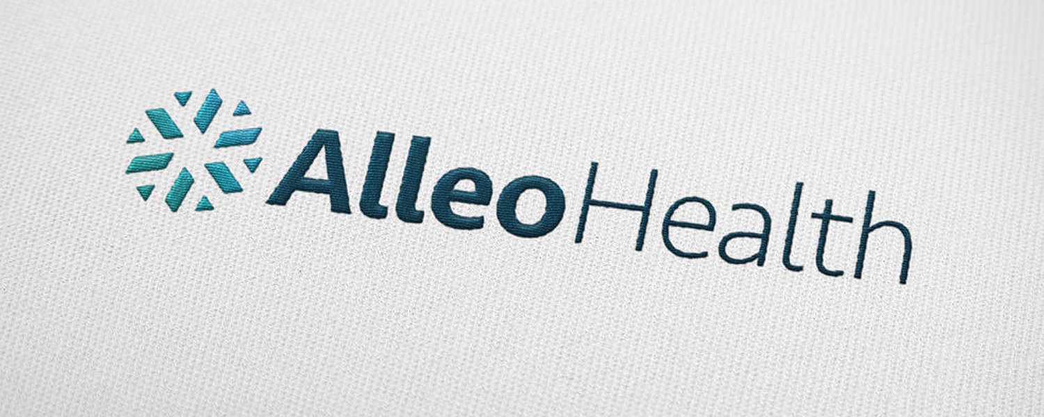
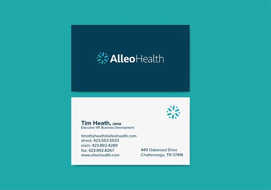
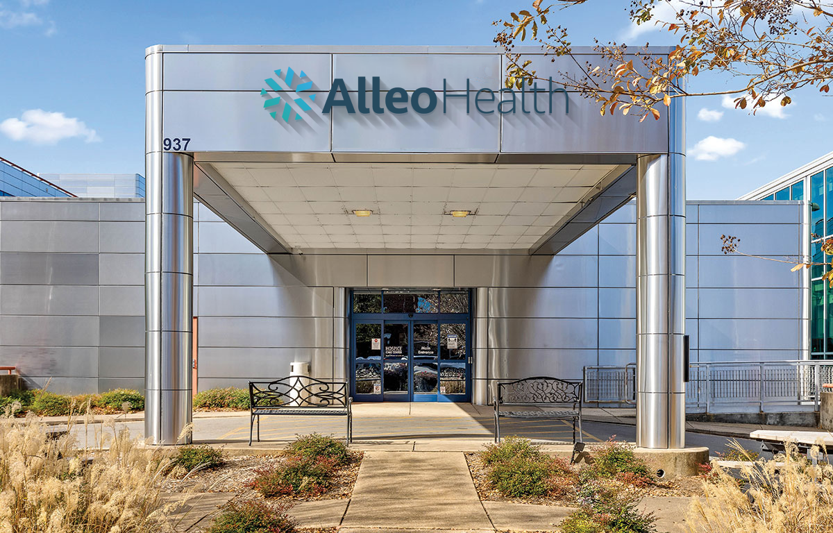
Alleo Brand Identity
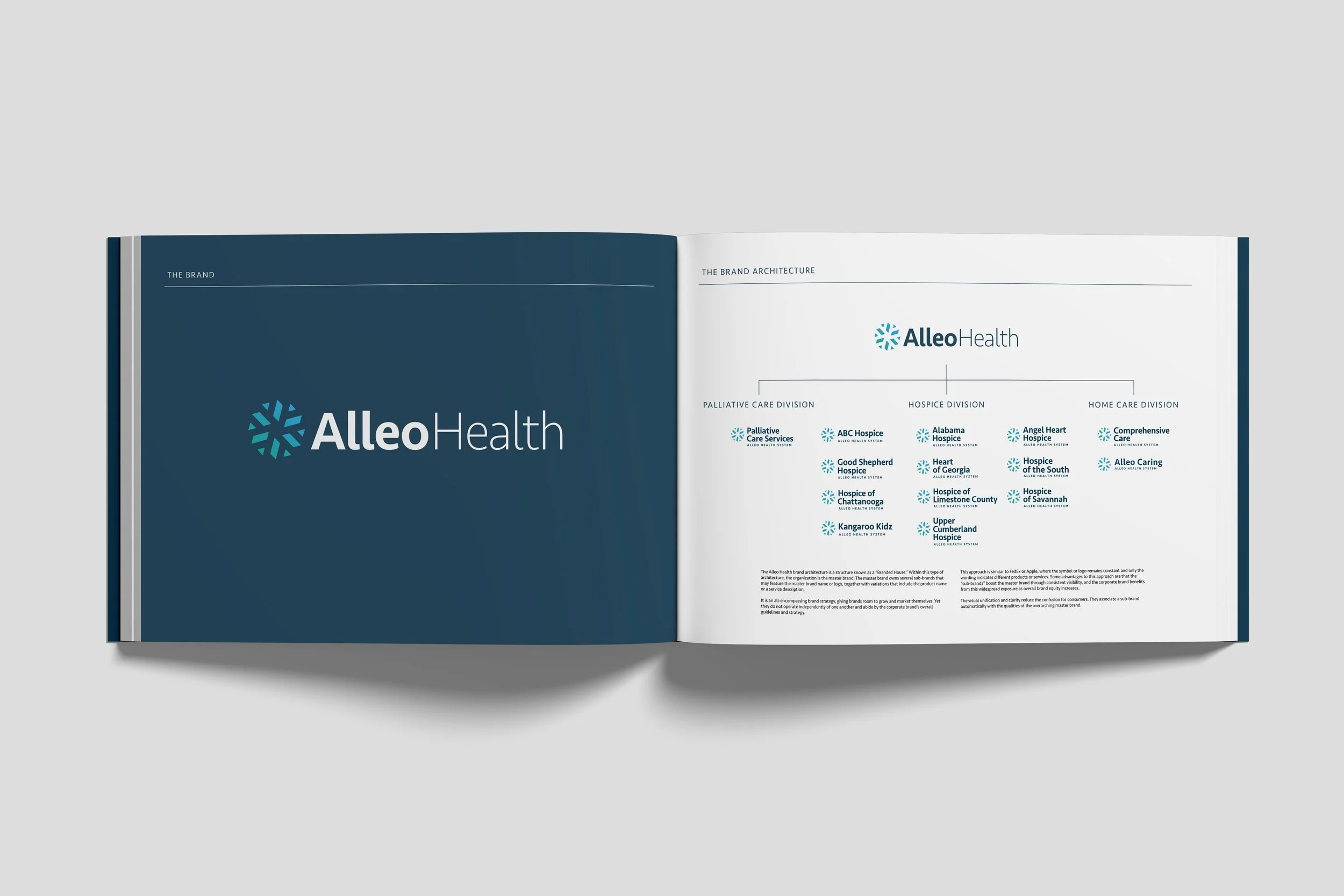
Hospice of Chattanooga has a proud legacy of providing compassionate care to patients and families across the Southeast. As the organization expanded its services—adding pediatric and perinatal care and growing into multiple states—it needed a unified brand to connect its network while honoring local roots. We partnered closely with the executive team to lead a full brand strategy, rebranding, and naming process. The challenge: unify a variety of distinct organizations under one cohesive identity without sacrificing local recognition.
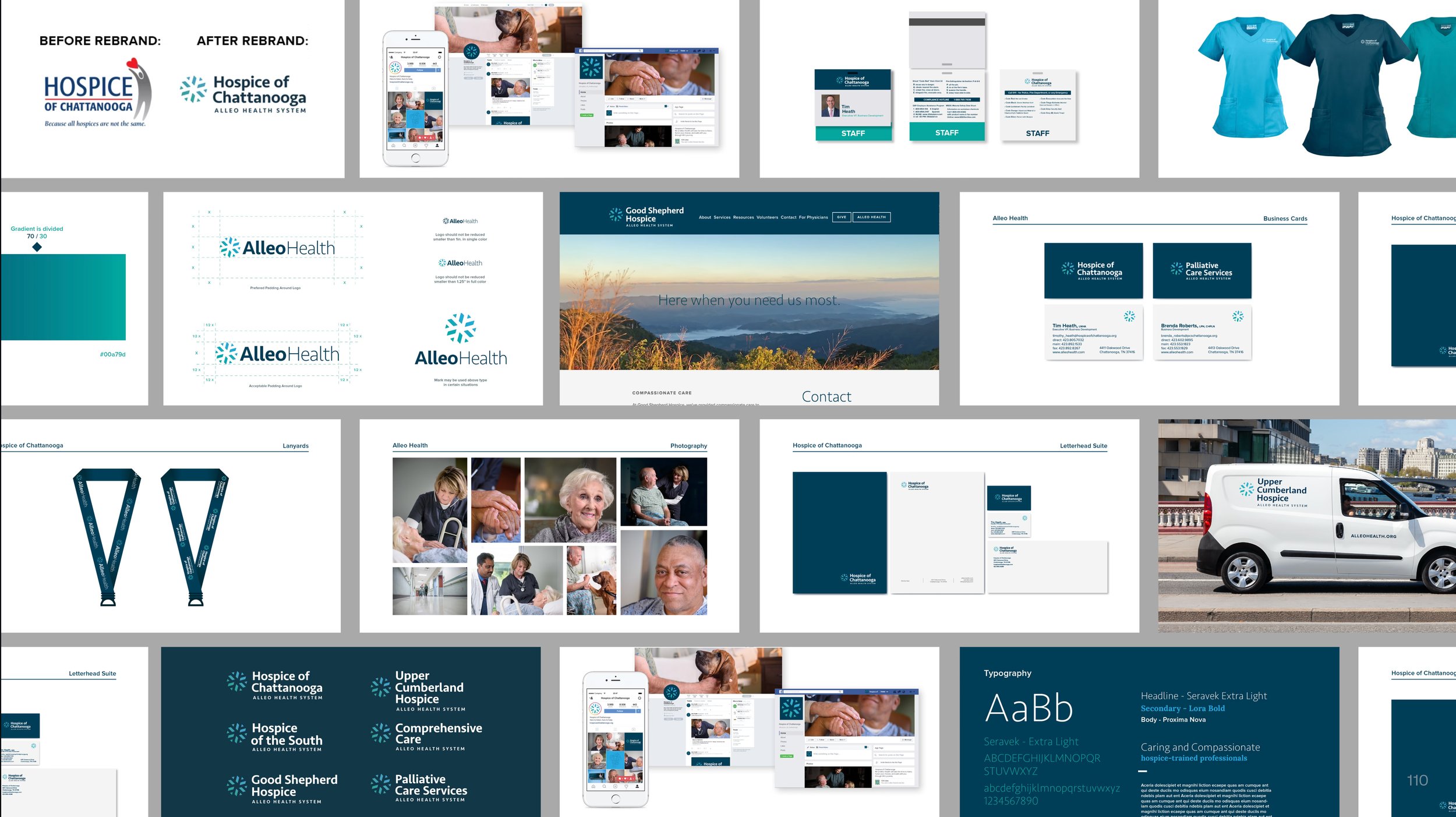
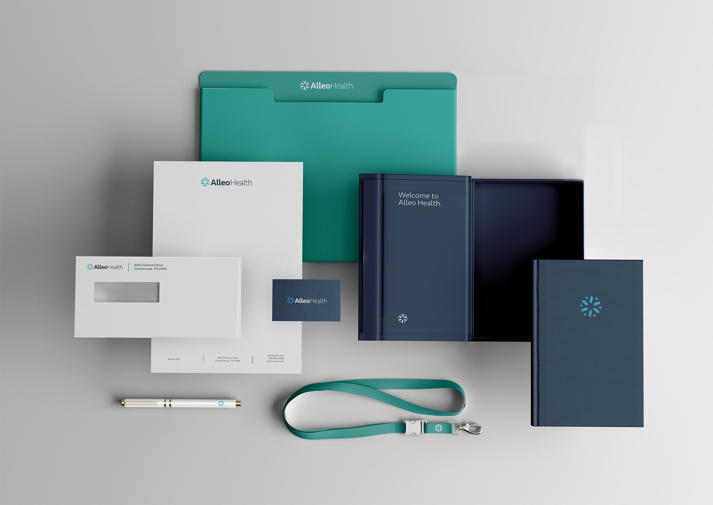
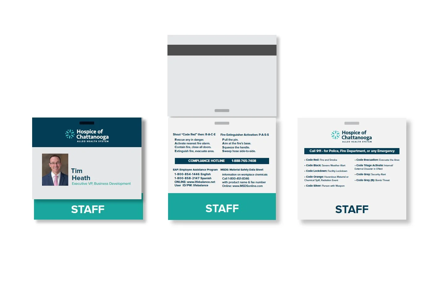
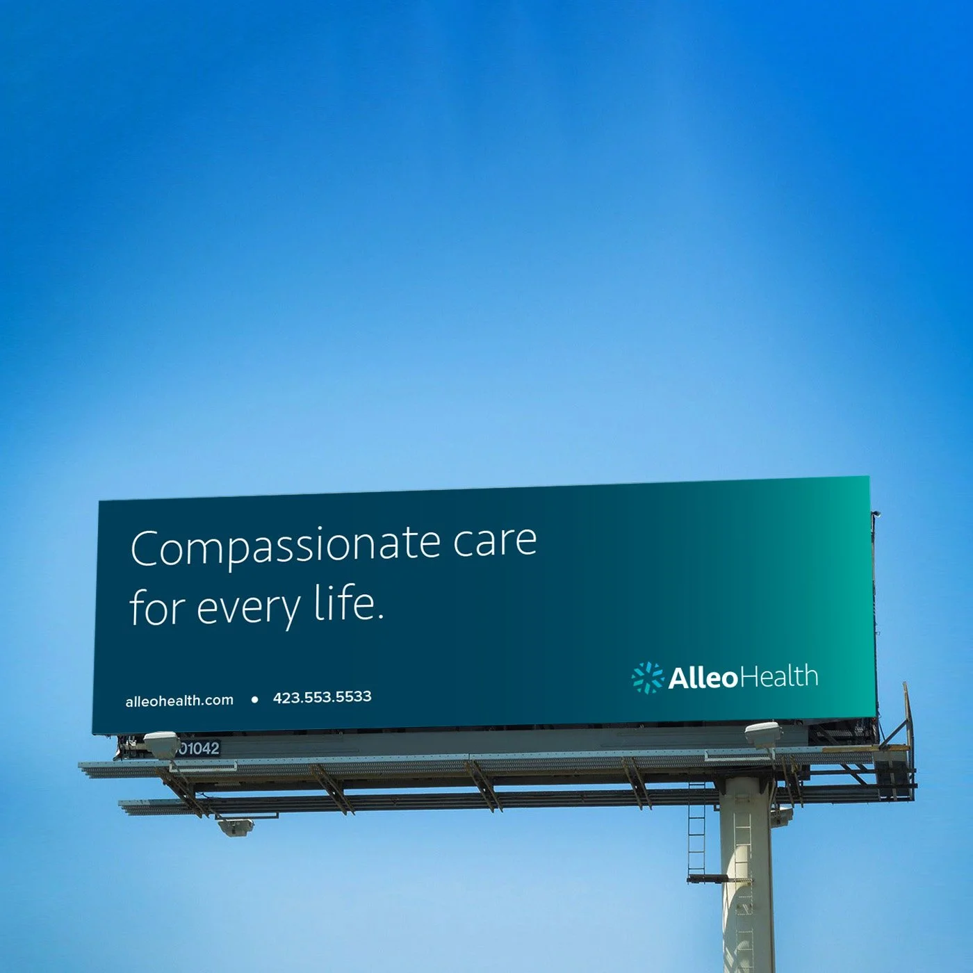
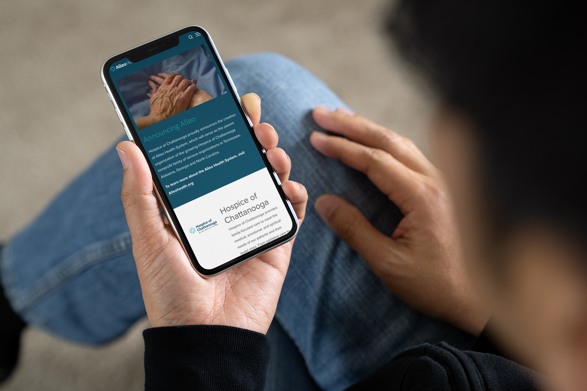
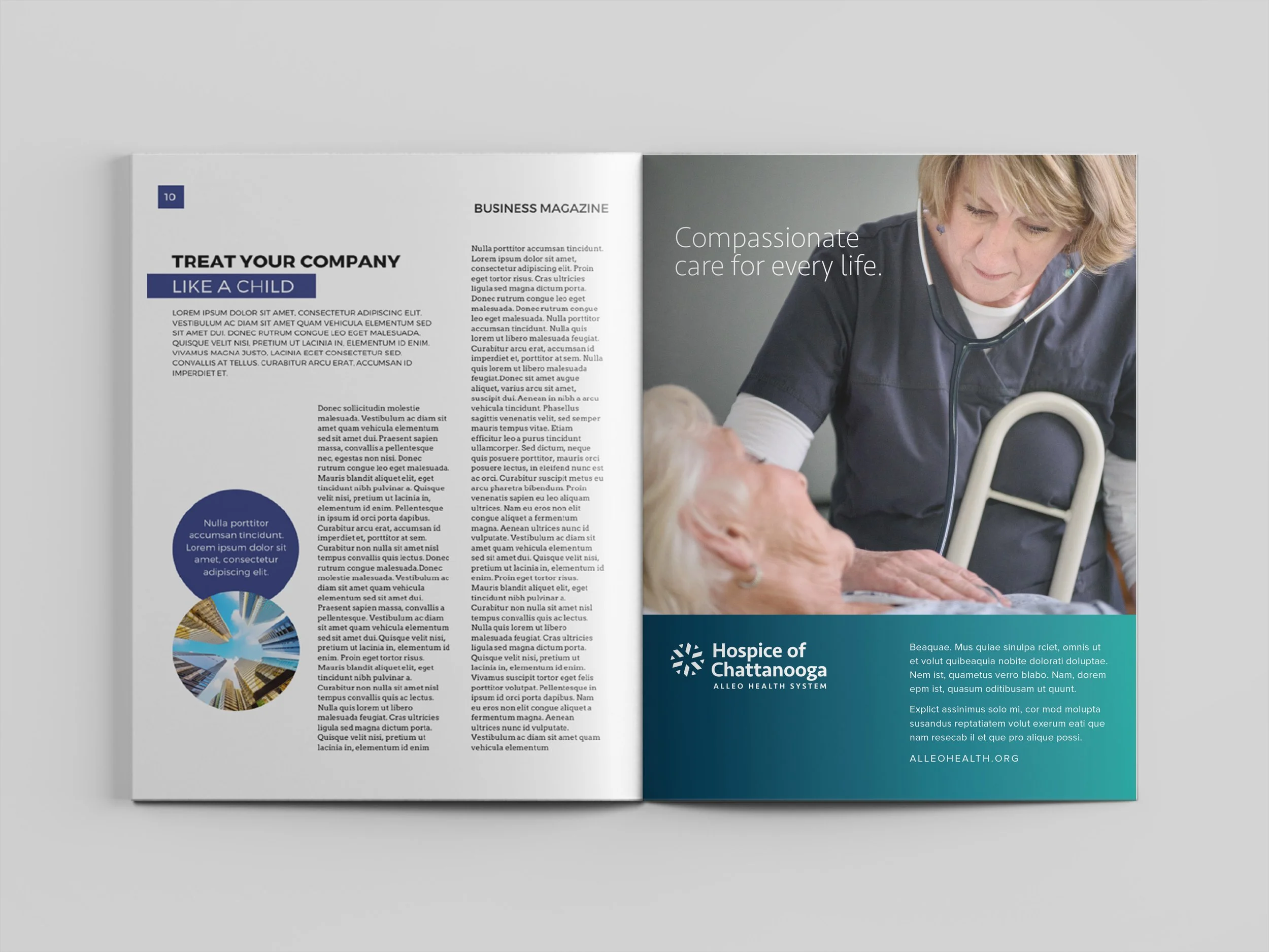
Together, we created a new name, brand architecture, logo, and visual identity system. The resulting brand—Alleo Health System—serves as an umbrella for all service providers, maintaining existing local names while aligning them through a cohesive visual and symbolic system.
This strategic rebrand fueled extraordinary growth, expanding Alleo’s reach to over 80 organizations in 15 states, driving revenues from deficit to seven-figure profits, and culminating in a transformative acquisition that established a new health-focused nonprofit with a $112 million endowment.
Services: Naming, Visual Identity + Brand Architecture, Writing, Website Designs (multiple), Ads, Outdoor, Video
Creative Direction: Paul Rustand; Design Direction: Liz Tapp; Design: Travis Hitchcock, Mark Slawson, Athene Ruiz, John Le, Ben Dicks; Writing: Jacob Biba; Photography: Dotson Commercial.