• About
  • WHITEBOARD
  • Archive
  • Contact
Menu

widgets & stone | Graphic Design and Branding Agency in Chattanooga, TN

  • About
  • WHITEBOARD
  • Archive
  • Contact

Next Level Baking

December 10, 2020

Next Level Baking

Grain Craft 2020 Ad Campaign

Widgets & Stone created a fresh look for the new Grain Craft ad campaign from late 2018 through 2019. The ads used the contrast of bright whites and colors against dark backgrounds to showcase the company’s many flours (as well as the products that the flours make). Along with presenting the products beautifully, the ads also stood out from the competition.

For the 2020 campaign the ads continued in a same vein, but began to focus more on the variety of products that Grain Craft flours can be part of – as well as to show some of the baking process. Designer Mark Slawson produced strikingly simple ads to communicate Grain Craft’s dedication to excellence.

The ads were translated to a variety of media, including print, digital and social.

Creative Director: Paul Rustand; Design Direction + Design: Mark Slawson; Writing: Jacob Biba; Photography: Dotson Commercial.

Tags Grain Craft, Widgets & Stone, advertising, ad design, photography, baking, flour, tortilla, bread, pizza

A True Beginning

June 11, 2015

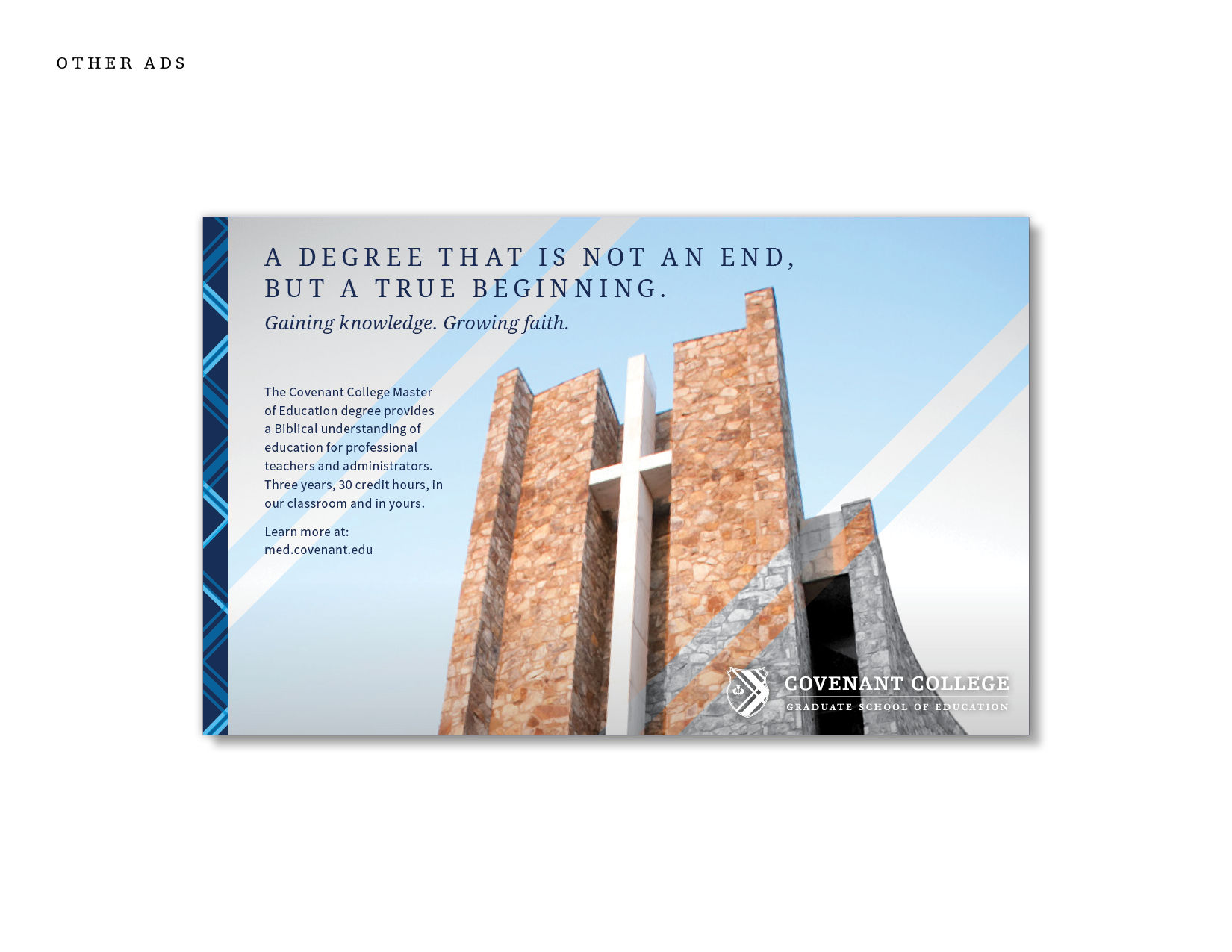
Gaining Knowledge. Growing Faith.

A new campaign for Covenant College’s Graduate School of Education

Covenant College believes that our understanding of the world informs and impacts every aspect of our teaching. So Covenant’s Graduate School of Education courses provide a Biblical understanding of education, which becomes the foundation of those in the profession of a teacher or administrator.

Covenant College launched a comprehensive new identity in 2004, but its application to the identity of the Graduate School of Education was not fully executed. For 2015 Widgets & Stone and 26 Tools were engaged to build new messaging for the school. 

The team worked together to create writing and designs that built on the identity of Covenant College, while still creating a sense of differentiation between the undergraduate and graduate programs.

Creative Direction: Paul Rustand; Design: Amy Harmon, Travis Hitchcock, Matt Greenwell; Writing: Caleb Ludwick, Keely Stockett Hungate; Photography: various source provided by Covenant College.

Tags Widgets & Stone, 26 tools, design, advertising, writing, Covenant College, graduate school, brand communications, identity

Couture Underfoot

February 17, 2014

Couture Underfoot

Amtico Ad Campaign 

Since 1964, Amtico has grown to dominate the premium resilient flooring market, by creating a remarkable product portfolio of luxury vinyl tile — synonymous with luxury, unmistakable style, custom capabilities, exceptional service, and quality products. In 2012, Amtico became part of the Mannington Commercial family. Because of the heritage of the name, Mannington created the Amtico Collection, encompassing all Amtico products, as the premium line of LVT in its broad portfolio.

Widgets & Stone and 26 Tools worked under direction from Mannington Commercial to propose brand communications tactics and then create various brand communications tools for Amtico — including an ad campaign to communicate the following key values and personality:

“Beautiful craftsmanship in both form and function. The Amtico Collection appeals to people with a passion for design, who appreciate luxury and sophistication. Embodies sophistication and elegance with a European/British sensibility – smart and timeless style that, at times, even brings a modern edge. A true quality product, known for high performing materials and durability. An honest, genuine partner who will work collaboratively, with international savvy yet a commitment to bringing great customer service to every relationship.”

Creative Direction: Mandy Meredith; Design: Mandy Meredtih; Writing: Caleb Ludwick; Photography: Grant Dotson.

Tags ad design, advertising, amtico, mannington commercial

Rules Are Good. Change Them.

December 29, 2013

Rules Are Good. Change Them.

Ad Concepts & Styles

Concept designs and writing for an ad campaign that didn’t make it past the first round of brainstorming. An intriguing product to investigate from a messaging standpoint — a wealth of history and style in how whiskeys are marketed. And the question we sought to address: How do you look different AND like you have enough experience when you are a very new brand?

Creative Direction: Paul Rustand & Mandy Meredith; Design: Bradley Dicharry, Paul Rustand, Mandy Meredith; Writing: Caleb Ludwick; Illustration: Paul Rustand. Photography: various.

Tags Widgets & Stone, advertising, design

Rock/Creek Rebrand

July 31, 2007

Rebranding a successful outdoor retailer for a future in the digital marketplace.

Rock/Creek understood that its past is part of its future. Although the logo of 20 years had served them well, it was time for a new identity that would communicate all they are and all they bring to the outdoor experience across multiple brand applications. And one that would help grow into a successful digital presence with online sales.

THE CHALLENGE:
Our challenge was to create a new look and feel for a well established store that not only captured what customers had loved about it for 20 years, but one that would be successful for the next 20 years.

Rock/Creek is committed to taking people into the outdoors. It enables people to move out into the world in new ways, discovering pathless trails and open roads, with all the promise they hold. Rock/Creek helps people to find themselves, get lost in the experience, and find themselves all over again. They do this through great products and great advice.

THE GOAL:
Our goal was to create a new brand identity that would communicate that this is a company that is established, strong and grounded, has great, fashion-forward outdoor products, and a love of simple beauty.

The goal of the brand design was to:

/ draw out the way Rock/Creek improves customer's lives

/ highlight customer experience and participation

/ be inspirational without being intimidating

/ remain true to the 20 year brick-and-mortar heritage

/ connect the parts of the brand that can grow with the company

THE WORK:
We provided a comprehensive visual identity for Rock/Creek. Our work included: logo redesign, photo styles, messaging and writing, print materials, wayfinding and signage design, and a digital design toolkit.

The new Rock/Creek brand captures the company’s storied personality and paves the way for a successful future digital marketplace. Since the launch of the new brand, online sales grew more than 15x, leading to a successful acquisition by Camping World. Over a decade and a half later, the brand remains timeless, relevant, and inspiring to the next generation of customers.

“The design team captured the core of who we are as retailers and turned our heritage into a new, exciting brand. Their method and the thoughtful nature of their work reinvigorated our own sense of direction and led to focus for growth.”
— Mark McKnight, Marketing Director

Tags Rock/Creek, rebrand, identity design, advertising, writing, Widgets & Stone

Latest Posts

1433 Williams Street, Chattanooga, TN 37408
+1 423-266-2221    info@widgetsandstone.com
A Whiteboard Company