• About
  • WHITEBOARD
  • Archive
  • Contact
Menu

widgets & stone | Graphic Design and Branding Agency in Chattanooga, TN

  • About
  • WHITEBOARD
  • Archive
  • Contact

Not Your Run of the Mill

June 6, 2022
View fullsize MT-LogoBoard.jpg
View fullsize MT-SCT-Original.jpg
View fullsize CM-Logos.jpg

Not Your Run of the Mill

Brand design for Mill Town

The Standard Coosa Mill was once an icon of Chattanooga’s manufacturing might. Neglected at the heart of the Ridgedale neighborhood—a shell of the building has stood for decades, empty and in disrepair— a stark contrast to Chattanooga’s celebrated city center just two miles North East.

Benwood, Chattanooga Neighborhood Enterprise, and Collier Construction have formed a partnership that will soon revitalize this abandoned 20-acre parcel. Through a sustainable redevelopment model, Milltown will deliver a unique Mixed-Use and Multi-family community—boasting contemporary office space, ground-floor retail and dining, coffee, single family stand-alone homes and townhouses, community center, public plaza, green space, and more.

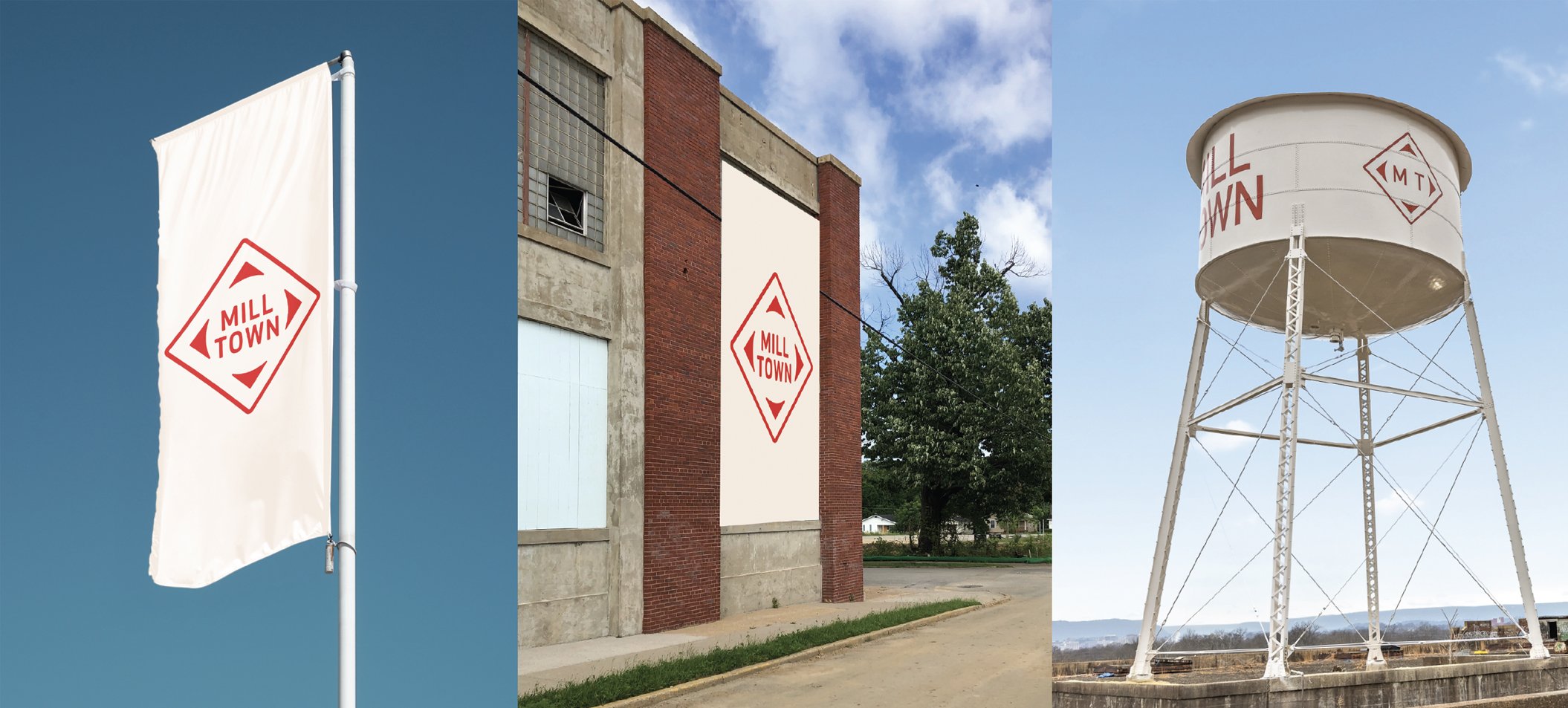
With a long history of partnering with Collier Construction, Matt Greenwell led the project to help name and brand the new development. The history of the place and the buildings helped provide inspiration both names — Mill Town for the development, Coosa Mill for the redesign of the factory — as well as for the design. The diamond shape of the now defunct Standard Coosa Thatcher Mill provided the foundation of the Mill Town mark. Bright bold colors and typography were selected to stand out in the environment.

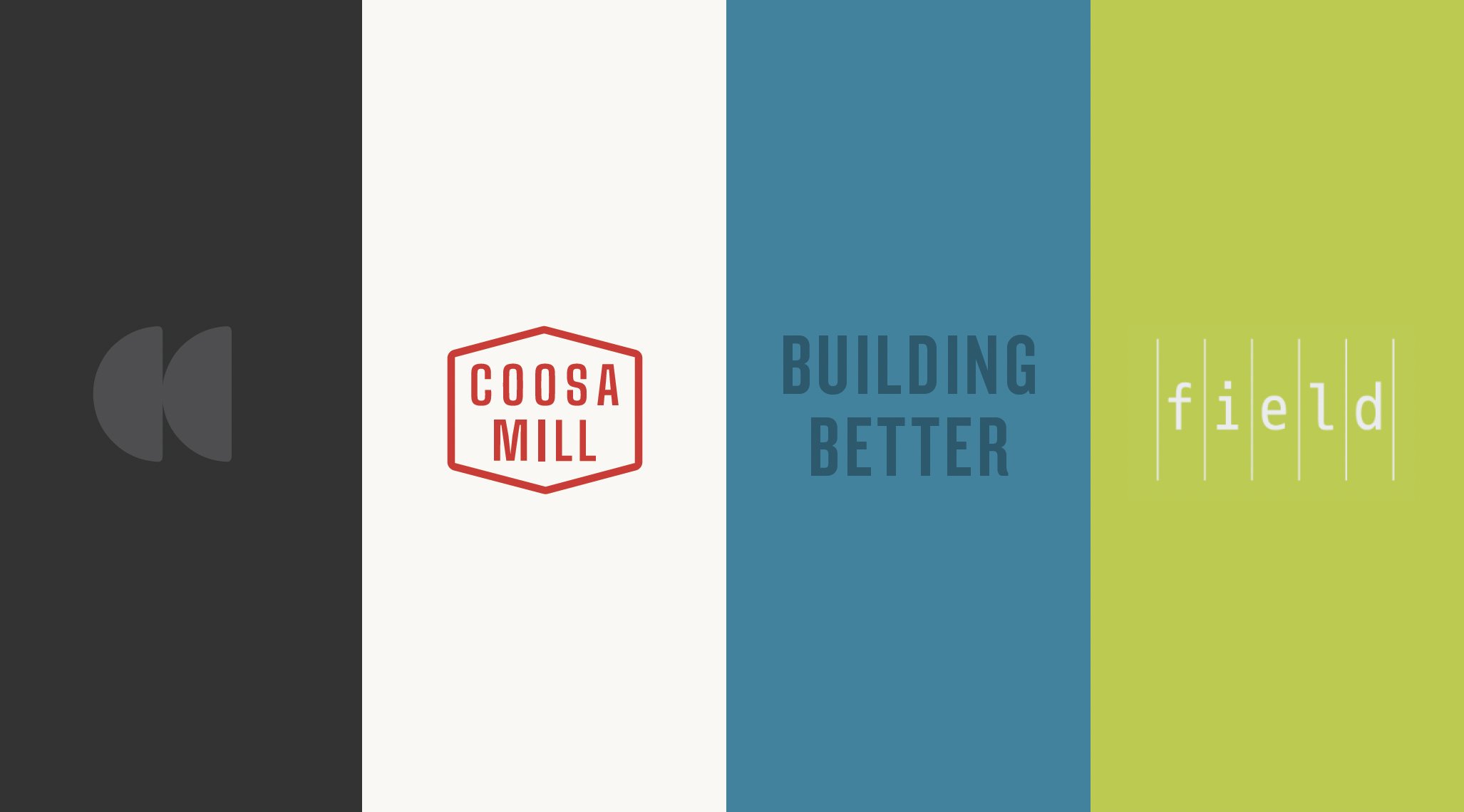
Along with all the new homes being built in the Mill Town development is the anchor structure of the old factory, Coosa Mill. The refurbished water tower provided the inspiration for the abstracted enclosure of the Coosa Mill logo, which mirrors the geometry of the Mill Town logo.

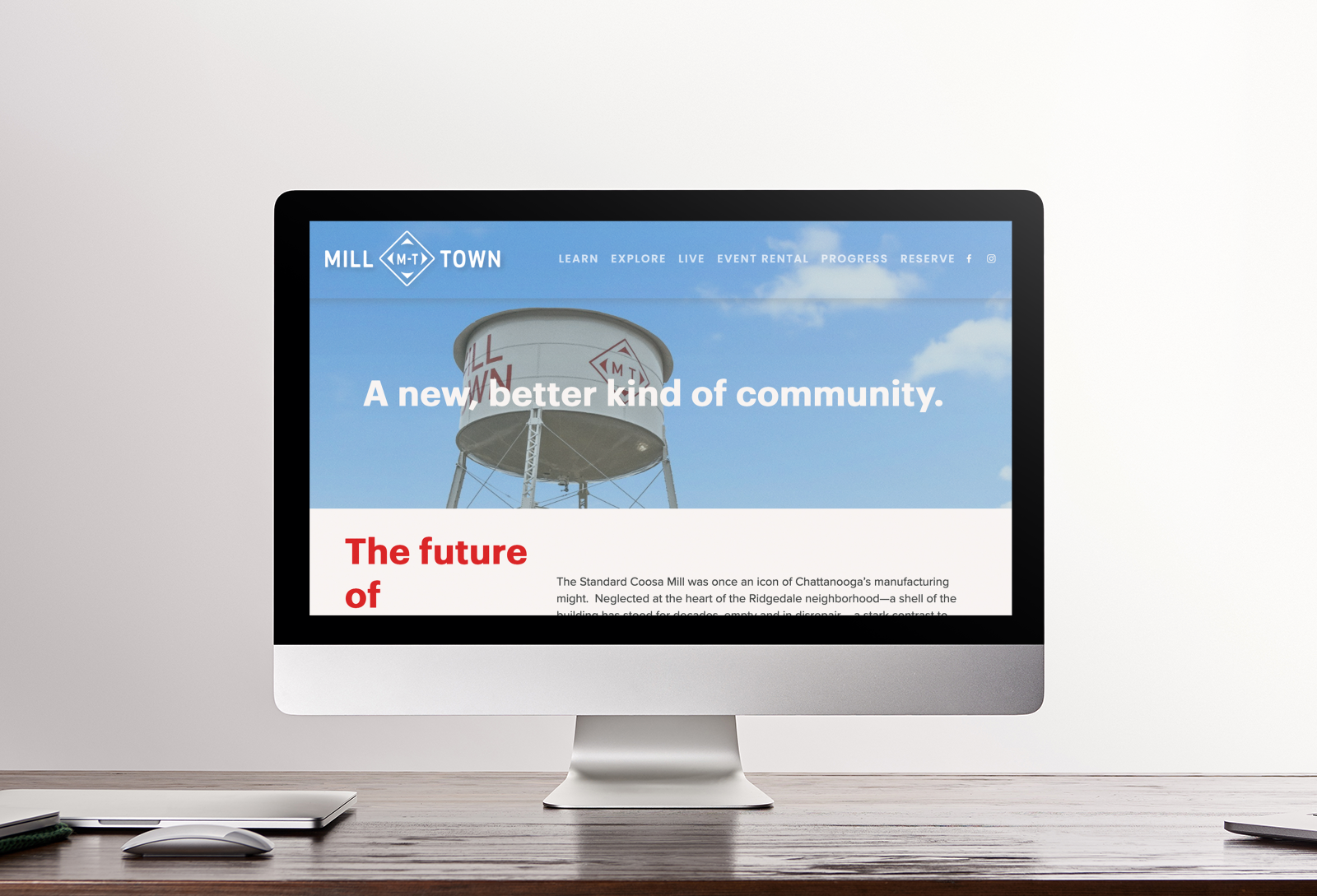
While very much still a work in progress, the Mill Town identity is slowly beginning to take shape. Signage, wayfinding, promotion and web design are helping to build this new and exciting development in the heart of the city.

Learn more about Mill Town here.

Creative Direction: Paul Rustand; Design Direction: Matt Greenwell; Design: Matt Greenwell, Mark Slawson, Emily Ricks, Liz Tapp, Noah Marlowe.

Tags Widgets & Stone, Identity Design, brand identity, collier construction, development, Mill Town, Coosa Mill, Chattanooga TN

Monkey See, MonkeDAO

May 4, 2022
View fullsize MonkeDAO_Final_Tshirt_mockup-183.png
View fullsize MonkeDAO_iPhone_Mockup_Final-01.png
View fullsize MonkeDAO_iPhone_Mockup_Final-02.png
View fullsize MonkeDAO_BrandStandards_Final_V2-02.jpg
View fullsize MonkeDAO_BrandStandards_Final_V2-03.jpg
View fullsize MonkeDAO_BrandStandards_Final_V2-06.jpg
View fullsize MonkeDAO_BrandStandards_Final_V2-09.jpg
View fullsize MonkeDAO_BrandStandards_Final_V2-12.jpg
View fullsize MonkeDAO_BrandStandards_Final_V2-17.jpg
View fullsize MonkeDAO_BrandStandards_Final_V2-13.jpg
View fullsize MonkeDAO_BrandStandards_Final_V2-08.jpg
View fullsize MonkeDAO_BrandStandards_Final_V2-16.jpg

Monkey See, MonkeDAO

New identity for the first NFT DAO on Solana

MonkeDAO is, the first NFT Decentralized Autonomous Organization (DAO) built on Solana cryptocurrency. The group works to provide unparalleled value to our members and the Solana ecosystem through community-led projects, connections and innovations. With the success of their initial NFTs (unique 8-bit Monkey portraits), the community is seeking to launch several new initiatives and needed a brand that could take them to the next stage of growth.

MonkeDAO built a culture that's quirky, fun, and irreverent, but also fairly bold — investing in the future of web3 while operating according to some pretty high libertarian ideals around rights to privacy, democratic processes, and the like. Kind of a fascinating collection of traits — playful, but also professional.

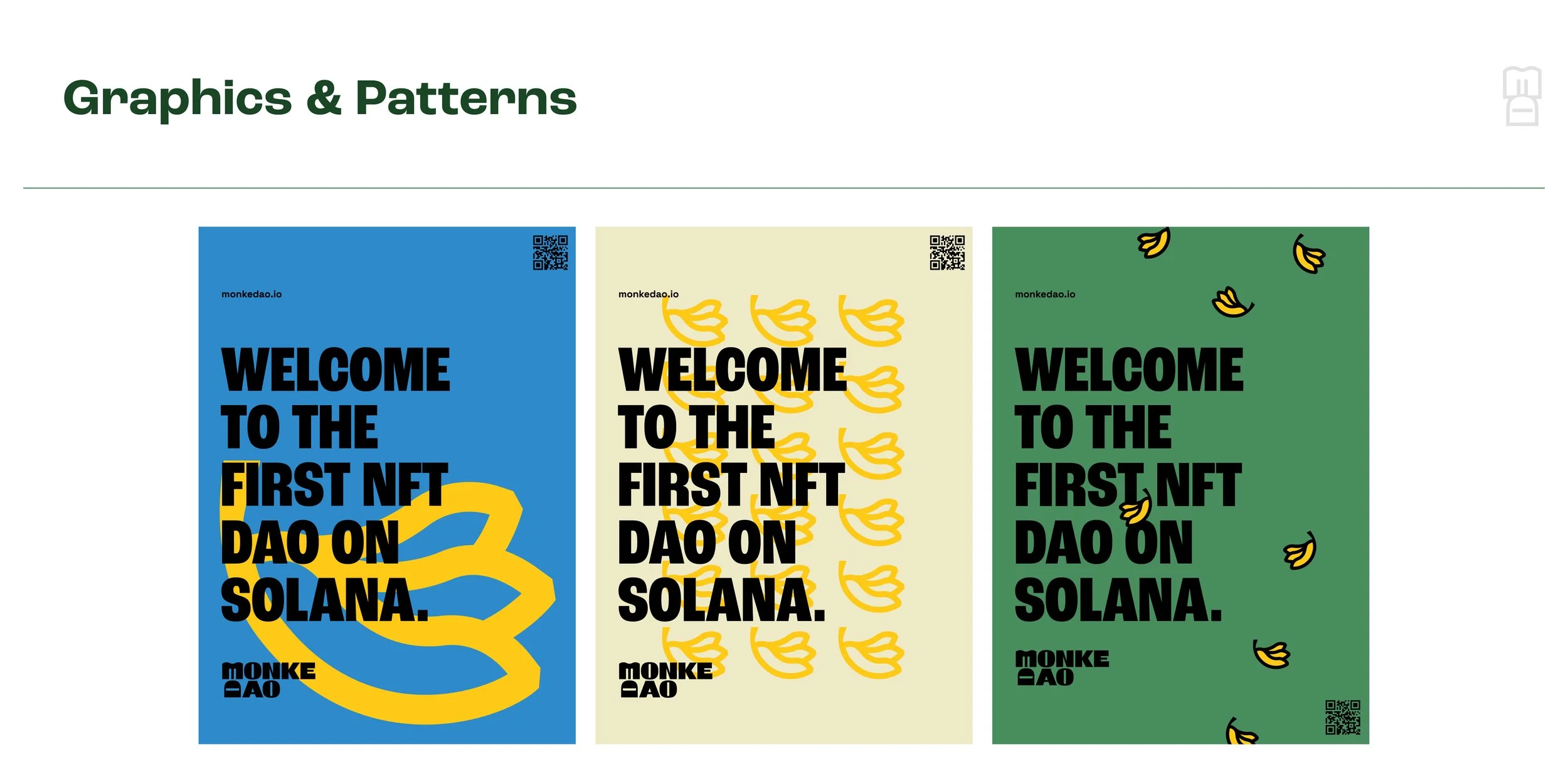
We wanted the visual impression of the brand to reflect that quirkiness—to feel quite bold and sure of itself while embracing some wonky, unconventional aesthetic decisions. The odd contrast in the logotype, the cheeky rotation of the "D", the use of color to create moments of high contrast, the heavy black lines in the icons—these decisions are all meant to feel quirky, but self-assured. Not subtle, but not wacky either.

Creative Direction: Paul Rustand; Design: Mark Walter.

Tags Widgets & Stone, brand identity, brand design, logo design, identity system, MonkeDAO, NFT, DAO, Solana

You Dream It, We Build It

December 13, 2019

You dream it, we build it

Stribling & Company Identity + Web

Strib Stribling is the experienced guide for the unforgettable trip that you didn’t know you needed. Whether it’s fly fishing in Patagonia, hunting for quail in South Georgia, or trekking the Himalayas in Tibet, Strib has the know-how to craft the perfect adventure tailored for you. 

We helped with naming, then created a logo and brand identity for Stribling & Company, along with helping to write and build a one page web site. We can’t wait to hear stories from all the once-in-a-lifetime trips Strib has lined up for next year.

Creative Direction: Paul Rustand; Design Direction: Liz Tapp; Design: John Le, Stephanie Fast; Writing: Jacob Biba; Photo/Video: Various stock.

https://www.striblingandcompany.com

Tags Widgets & Stone, Stribling & Co., outdoor adventure, web design, logo design, writing, outdoor trips, custom trips, identity design, brand identity

Latest Posts

1433 Williams Street, Chattanooga, TN 37408
+1 423-266-2221    info@widgetsandstone.com
A Whiteboard Company