• About
  • WHITEBOARD
  • Archive
  • Contact
Menu

widgets & stone | Graphic Design and Branding Agency in Chattanooga, TN

  • About
  • WHITEBOARD
  • Archive
  • Contact

Champions of Your Cause

June 21, 2018

Champions of your cause.

Cempa Rebrand

Since 1986, Chattanooga CARES’ mission has been to reach, assist, and support people impacted by HIV. Recently, CARES’ services have grown to cover Hepatitis C, STIs and many other primary care services. Along with that growth, the organization is expanding well beyond the city of Chattanooga. They have done this with compassionate and responsive delivery of education health, social, and advocacy related services. 

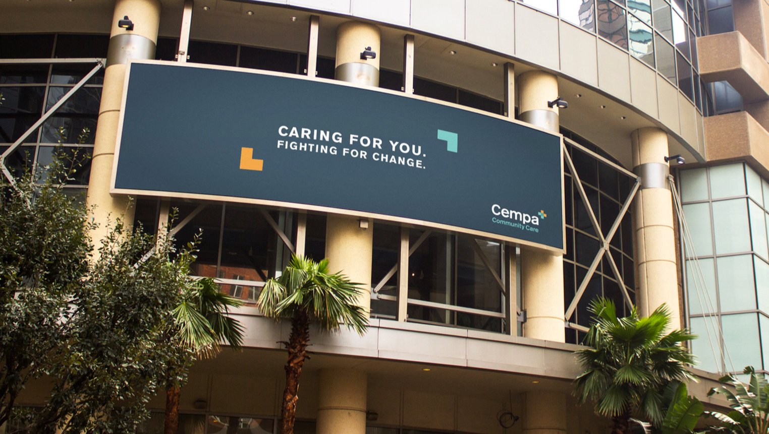
Because of this growth, the Board of Directors felt that the organization needed a new name and identity that reflected their expanding services and service area. After an extensive naming process, the board landed on Cempa Community Care and Widgets & Stone went to work on identity designs.

The end result is a strong typographic approach that is clean and understated – both professional and approachable. The medical cross is formed by the overlapping of two arrows, arrows that also double as framing devices or symbols of movement. Flat color combines with warm photography to present information clearly. 

The board also wanted to keep the Chattanooga CARES name, utilizing it for the foundation side of the organization. Widgets & Stone redesigned the heritage logo to fit with the new brand design.

Creative Direction: Paul Rustand; Design Direction: Liz Tapp; Designer: Mark Slawson; Photography: Stock; Writing: 26 Tools.

Tags Widgets & Stone, 26 tools, rebrand, identity design, logo design, healthcare, cempa

EF Contract Rebrand

March 2, 2018

A New Day

EF Contract Rebrand

Engineered Floors, LLC restructured and rebranded the commercial flooring businesses of Bolyu Commercial and Aqua Hospitality, following Engineered Floors’ purchase of the operating assets of the Beaulieu Group.

Bolyu and Aqua has been rebranded as EF Contract and EF Hospitality.

Brad Root, the Senior Vice President of Sales and Marketing tapped the creative teams Widgets & Stone and 26 Tools to develop the new brand and communications tools to present to the company and the industry. We created a straightforward and pragmatic identity to reflect the new brand’s personality and the new product’s quality.

EF Contract will offer modular carpet, broadloom carpet, LVT and Kinetex, an advanced textile composite flooring that combines key attributes of carpet with the long-wearing performance characteristics of hard-surface flooring. EF Contract will focus on the low-to­ mid range of the flooring market.

Confidence in perfomance.

Surprisingly beautiful.

Relentless service.

Tags Widgets & Stone, rebrand, logo design, identity, 26 tools, EF Contract, EF Hospitality

CFC: 10 Seasons

March 1, 2018

10th Season /Season Pass Promo

Chattanooga FC 2018

To help promote sales of the 2018 season pass packages for soccer powerhouse Chattanooga Football Club, Widgets & Stone created a hype video for multiple media channels that captures the history and passion of the club.

Creative Direction: Paul Rustand; Director/Editor: Drake Rustand; Writer: Caleb Ludwick (26 Tools); Videography: Witt Hullander, Jay Kaley, and various; Narration: Peter Woolcock.

Tags Widgets & Stone, Peter Woolcock, Drake Rustand, Witt Hullander, chattanooga fc, soccer, video, promo, Caleb Ludwick, 26 tools

Cold Comfort

September 29, 2017

Cold Comfort

Norspring: Naming and Logo

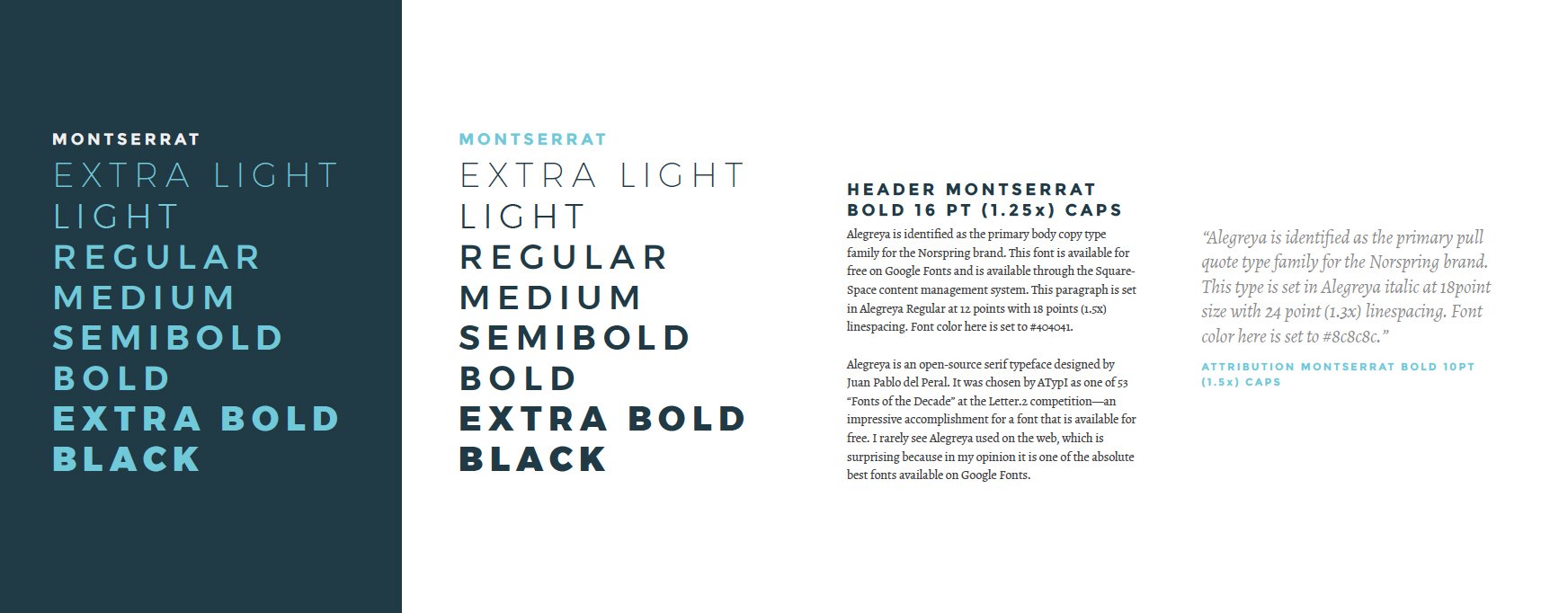
Norspring Center for Rejuvenation was founded in 2017 in Chattanooga, TN by a group of health and business professionals with one common goal: to offer new methods for overall health and wellness that provide complete whole body rejuvenation through innovative therapies – including cryotherapy. Combined with other therapies, Norspring’s offerings are advanced and effective ways to use the natural recovery power of our bodies. These innovative therapies enhance wellbeing and can provide improved performance, increased vitality and overall revitalization.  

The NORSPRING name was born from the idea of hygge and the renewal of life in the springtime. Hygge — pronounced,  "hoo-gah" — an approach to living that embraces positivity and enjoyment of everyday experiences, said to be core concepts of attitudes to life in the Nordic region. Hygge is the idea that even in the cold Norwegian winters, Norwegians experience warmth and coziness in their homes. 

26 Tools and Widgets & Stone worked together to create a name and logo for the new cryotherapy company that reflects their values and goals.

Creative Direction: Paul Rustand, Caleb Ludwick; Design: Brad Dicharry.

Tags Norspring, cryotherapy, studio, logo design, naming, design, Widgets & Stone, 26 tools, Chattanooga TN

Dye Another Day

May 4, 2017

Dye Another Day

Econyl Natural Ads

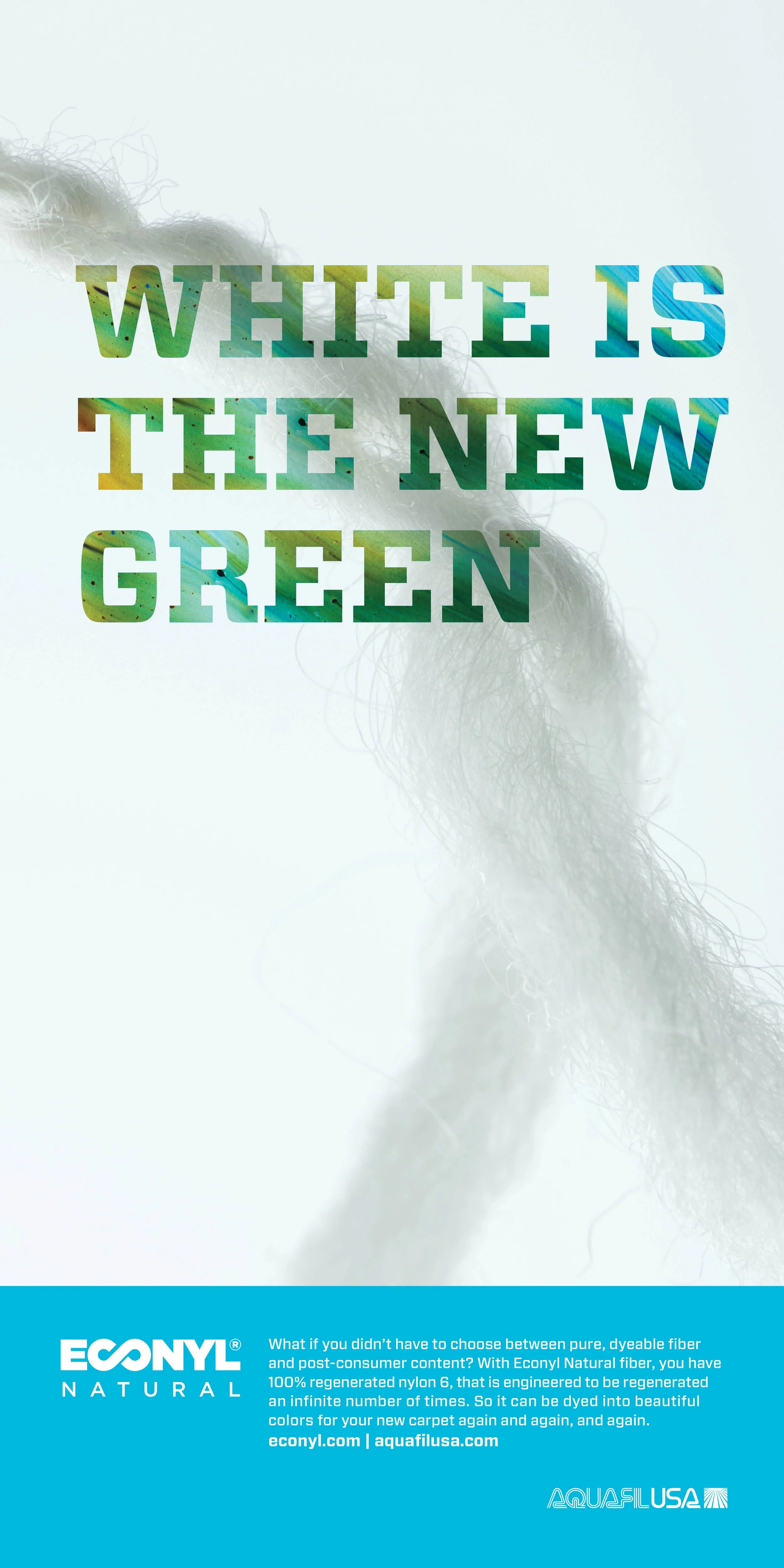
Aquafil’s polymers and fibers are used in the manufacture of hundreds of products that meet the needs of a wide range of worldwide markets – corporate, industrial, travel, design and home. 

Aquafil’s sustainable manufacturing processes produce fully regenerable nylon 6 – so every product that comprises one of Aquafil’s becomes a little more eco-friendly.

Widgets & Stone and 26 Tools developed these ads to showcase the new Econyl Natural product.

Creative Direction: Mandy Lamb; Design: Mandy Lamb, Paul Rustand; Writing: 26 Tools.

Tags 26 tools, Widgets & Stone, ad design, Aquafil USA

Happy Family, Happy Design

January 19, 2017

Happy Family, Happy Design

A redesign for a trio of sites

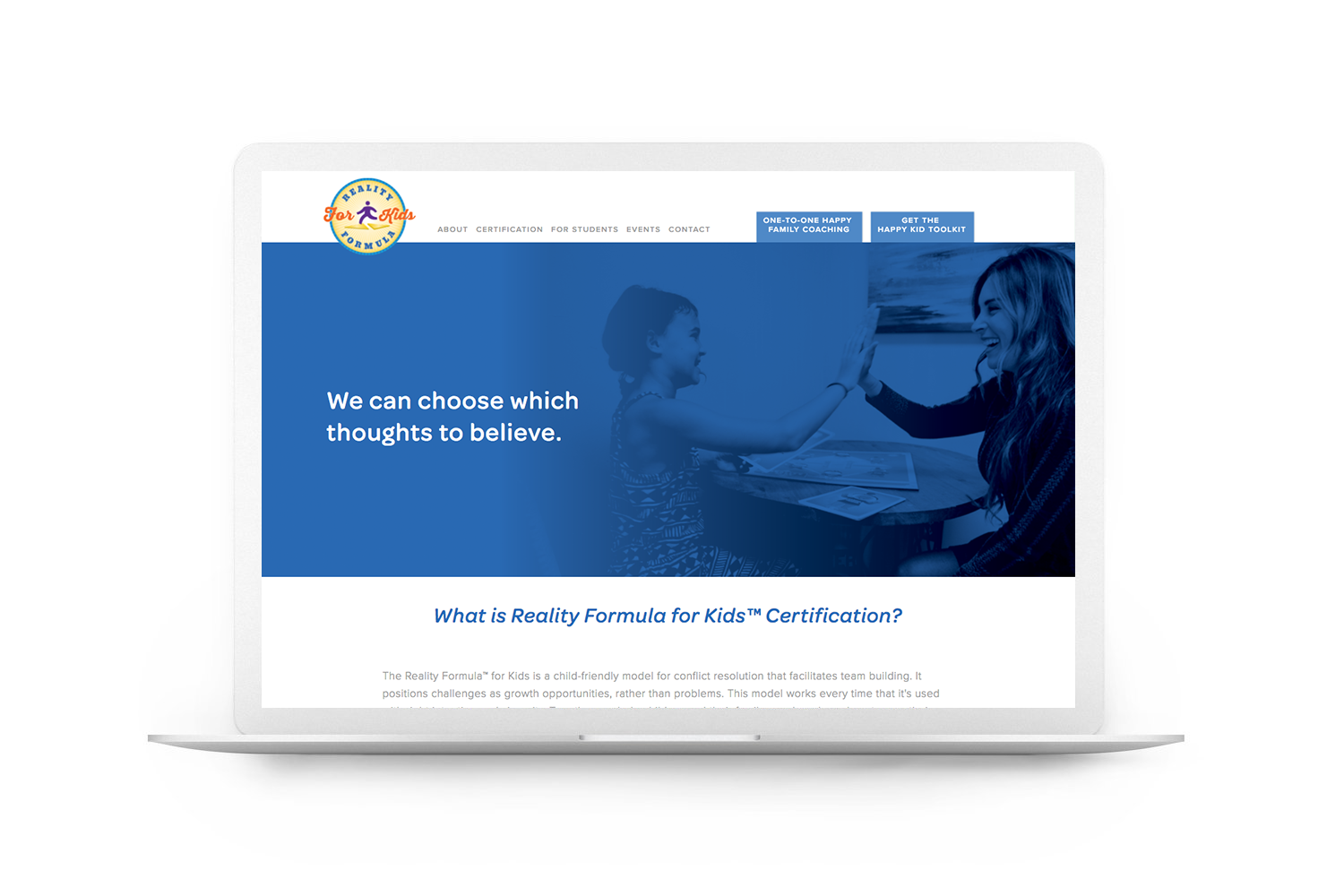
Danielle Alvarez Greer is known professionally as “The Happy Family Coach.” She is the co-founder and owner of The Reality Formula for Kids and the Happy Kid Toolkit. 

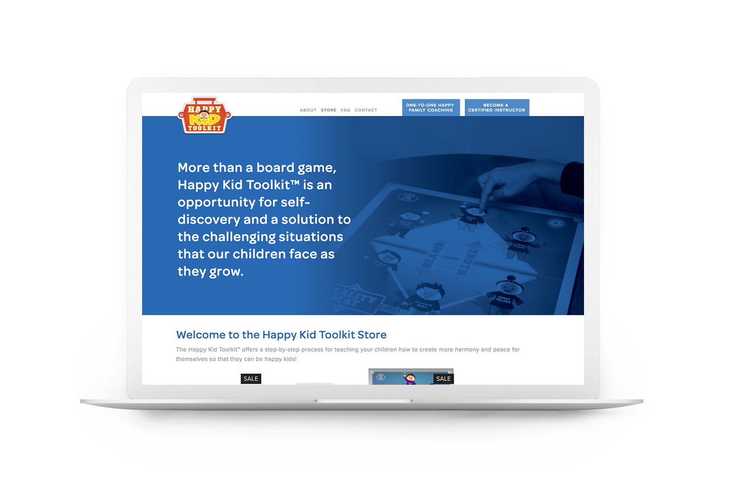
The Reality Formula for Kids is a child-friendly model for conflict resolution that facilitates team building. It positions challenges as growth opportunities, rather than problems. This formula is utilized in the Happy Kid Toolkit, which is a sort of board game: a training tool that provides an opportunity for self-discovery and a solution to the challenging situations that children will inevitably face as they grow. 

As Danielle prepared to launch her new Toolkit product, she realized she needed a more unified and functional family of web sites to help her coordinate – and distinguish — her related products and services. Liz Tapp led the comprehensive redesign of all three sites, integrating a variety of videos and tools into Squarespace templates. Keely Hungate of 26 Tools led the messaging strategy and writing for the new sites.

The end result is a cohesive and an organized set of sites, all clearly part of the same family of brands. See a video walkthrough of the site features here.

Art Direction, Design, Photography and Production: Liz Tapp.

Tags Liz Tapp, redesign, Happy Family, Happy Kid, Widgets & Stone, 26 tools

The Shape of Things to Come

January 13, 2017

The Shape of Things to Come

Surfaces 2017 Viewbook

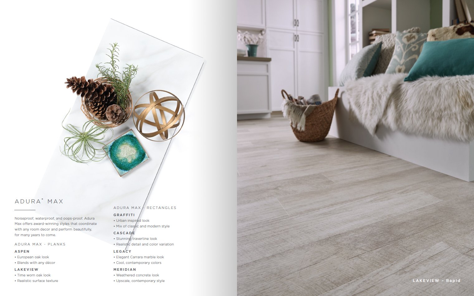
For the second year in a row, Widgets & Stone created the look and feel for Mannington’s view book for Surfaces, the international event for floor covering. The design team worked from the client’s theme: The Shape of Things to Come and new product development to produce the clean and elegant overview.

Laura Michael took the lead on design, art directing the still life photos by Dotson Commercial and creating the entire layout of the booklet. Travis Hitchcock and Liz Tapp contributed cut-out customized type design for the cover.

Design Direction: Mandy Lamb; Art Direction: Laura Michael; Design: Laura Michael, Travis Hitchcock, Liz Tapp; Photography: Dotson Commercial; Writing: 26 Tools.

Tags Surfaces, mannington commercial, mannington residential, Widgets & Stone, design, 26 tools, Dotson Commercial

ID for the ID

October 11, 2016

ID for the ID

Innovation District Identity

The City of Chattanooga defined an innovation district—or more accurately, described it by circling a large portion of downtown on a map. Unfortunately, the City initially contracted an “identity design” from an online logo generator, and created signage using the mark.

Although City leaders were well-intentioned, as might be expected, the Chattanooga design community raised its eyebrows, then its hands, then its voices.

So the City put out an RFP for a proper identity to be developed. One that grew out of the community, represented it, and tapped local talent.

The Mayor describes the Innovation District as “A catalytic mix of start-up businesses, business incubators & accelerators, alongside innovation economy generators & amenities—available in a dense, walkable urban core.” Drawn in a way that includes parts of the University of Tennessee at Chattanooga, the revitalized Southside, and much of the urban core—the district is centered on a Market Street building called the Edney Innovation Center, which serves as “a connecting point, support base, and catalyst for the local entrepreneurial ecosystem.”

However, innovation here is not limited to technology or entrepreneurship. It can happen in any field. It can pop up anywhere, from the Edney Building to the parks, the Community Kitchen to coffeeshops.

“There’s an irony to creating a brand about an innovation district,” said collaborator Caleb Ludwick of 26 Tools llc. “Innovation, at its best, is something they can’t be programmed. It’s like inspiration or good luck: it happens, and the best you can do is have the right people in place, and be prepared to catch it and hold onto it as it takes flight. We wanted to create an identity that—while more a logo than a fully shaped brand—gives a focal point to the focal point, creates a unified look and feel that can be implemented throughout the district, helps shape a narrative for the future, and hopefully opens doors for everyone.”

The design process dove deeply into the potential of the District. Asking questions like: What sort of impacts does the district have? On which people? What technologies? Jobs? Education? Resources? Health? And in this day and age, what does innovation mean, anyway?

“We were very fortunate that the Mayor’s office, River City Company, and the Enterprise Center allowed us to put together a team of writers and designers who have the talent and the experience to pull off such an effort,” said Paul Rustand of Widgets. “We’re very proud of what we’ve made together, because it captures and expresses not only our pride in Chattanooga but also in the great ideas that are born here, every day.”

Creative Direction: Paul Rustand; Design Direction: Caleb Ludwick, Aggie Toppins/The Official Studio, Matt Greenwell; Design: Travis Hitchcock; Research and Strategy: 26 Tools, Paige Southard; Production: Range Projects, Professional Sign Services.

Tags Widgets & Stone, 26 tools, The Official Studio, innovation district, logo, identity design

A Billboard That Stands for Something

September 1, 2015

A Billboard That Stands for Something

Billboards for Education Identity

Billboards for Education was created to give hope and support to local educators who struggle with an ever-present lack of classroom resources. As an outdoor advertising company, we use a proven, profitable business model to generate revenues. We then donate 10% of every dollar, from every billboard ad, to local schools. Earning for learning.

Owner and founder Matt Richman realized at the young age of 17 that true greatness is not defined by how much a person has, but how much a person gives. This realization prompted him to change his ultimate professional goal from gaining as much wealth as possible, to positively impacting the lives of as many people as possible.

Already an experienced business owner and entrepreneur, Matt realized the importance of a strong brand identity and writing. He reached out to Caleb Ludwick (26 Tools) and Paul Rustand (Widgets & Stone) to help. Together the team created a set of visual and verbal tools to help Matt establish his new venture and communicate is goals and differentiation points.

Find out more at www.billboardsforeducation.com

Creative Direction: Paul Rustand; Design: Casey Yoshida; Writing: Caleb Ludwick, 26 Tools.

Tags Billboards for Education, Widgets & Stone, 26 tools, design, writing, identity, identity design

Un-Untouchable

June 23, 2015

Un-Untouchable

Dalit Freedom Network

In the world’s largest democracy, 250 million Dalit people are denied freedom, justice, and human dignity, because they are considered worthy only to be enslaved, broken, crushed. Untouchable. But after 3,000 years of oppression, they are standing up for the rights of their children to live in freedom and dignity.

Their leaders asked for our help in bringing their need, and new hope, to the world’s attention—as well as help in positioning to help build schools that are open to all children, 
bring healthcare to communities, and develop economic opportunities, and advocate for their safety. Working with 26 Tools, we joined a team of international development researchers, writers, designers, and web developers to help shine a light on remarkable people changing their own lives, and talk about ways that we can come alongside them

In looking at the landscape of social action, 26 Tools identified two mistakes to avoid: 1) slapping a sleepy Western public with a message of Wake up!, which puts too much focus on the organization as cultural prophet, and 2) celebrity endorsements and activism as a culture of cool, which puts too much focus on the donor as change agent.

Both of these approaches cheapen the suffering of real people, and can erode an organization’s credibility. So over the course of 5 months, we shaped a messaging system that highlights real interactions with freed people. Emphasizing both good words and good work, talk and action.

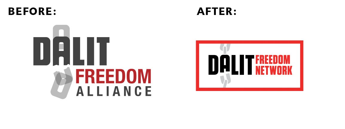
Dalit Freedom Network USA requested a complete rebrand, and Widgets & Stone delivered solid design solutions. While the international headquarters agreed that single brand solution was wise, they requested that it be built on the already established logo. So the team revisited concepts and revised designs to make it work.

Whiteboard built on writing and design styles developed to completely rebuild the web site: www.dalitnetwork.org

Creative Direction: Caleb Ludwick, Paul Rustand; Design: Amy Harmon, Benjamin Dicks; Writing: Caleb Ludwick; Development Research & Consulting: Emily Talley; Web Design & Development: Whiteboard; Photography: provided by the client.

Tags Dalit Freedom Network, untouchables, Widgets & Stone, 26 tools, whiteboard, design, redesign

A True Beginning

June 11, 2015

Gaining Knowledge. Growing Faith.

A new campaign for Covenant College’s Graduate School of Education

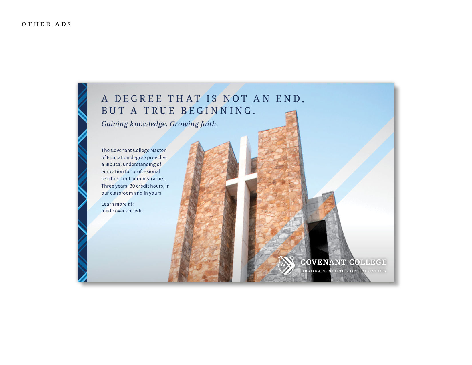
Covenant College believes that our understanding of the world informs and impacts every aspect of our teaching. So Covenant’s Graduate School of Education courses provide a Biblical understanding of education, which becomes the foundation of those in the profession of a teacher or administrator.

Covenant College launched a comprehensive new identity in 2004, but its application to the identity of the Graduate School of Education was not fully executed. For 2015 Widgets & Stone and 26 Tools were engaged to build new messaging for the school. 

The team worked together to create writing and designs that built on the identity of Covenant College, while still creating a sense of differentiation between the undergraduate and graduate programs.

Creative Direction: Paul Rustand; Design: Amy Harmon, Travis Hitchcock, Matt Greenwell; Writing: Caleb Ludwick, Keely Stockett Hungate; Photography: various source provided by Covenant College.

Tags Widgets & Stone, 26 tools, design, advertising, writing, Covenant College, graduate school, brand communications, identity

The Art of Engineering

April 1, 2015
tumblr_nm54t4v7RG1rxp6kio2_1280.png
tumblr_nm54t4v7RG1rxp6kio5_1280.png
tumblr_nm54t4v7RG1rxp6kio3_1280.png
tumblr_nm54t4v7RG1rxp6kio4_1280.png
tumblr_nm54t4v7RG1rxp6kio6_1280.png
tumblr_nm54t4v7RG1rxp6kio7_1280.png

AdTech

The Art of Engineering

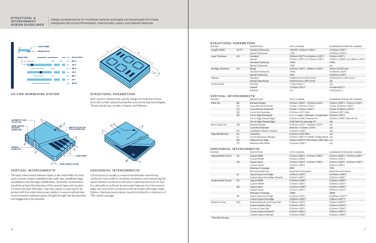
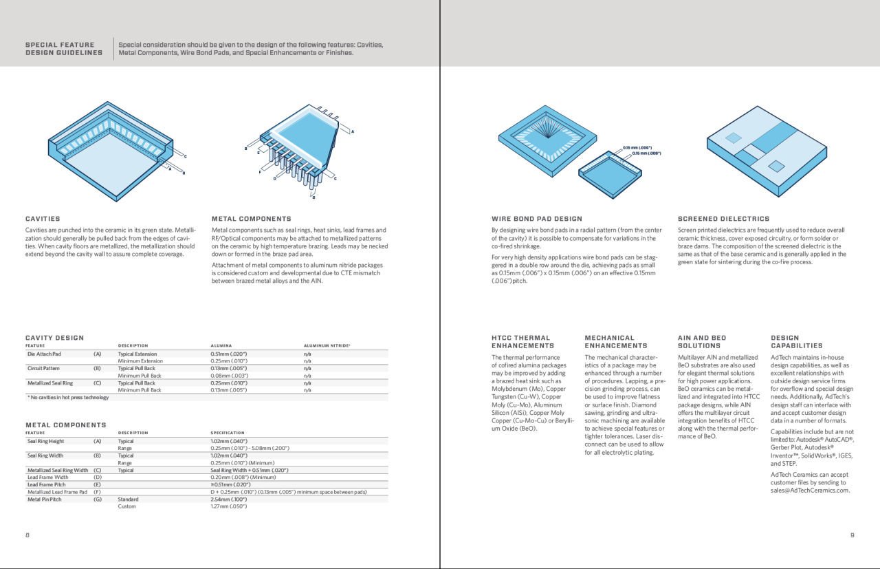
AdTech (Advanced Technology) Ceramics specializes in engineered, mission-critical ceramics for challenging environments. They deliver on complex challenges that other manufacturers avoid, producing the finest quality ceramics in any industry. Shaping them to be stronger, more durable, more precise than what seems possible.

AdTech has a long and rich history in engineering high performance ceramics, but the company’s market share had declined over time. AdTech’s promotional materials and web site were woefully out of date and did not reflect their high tech capabilities accurately.

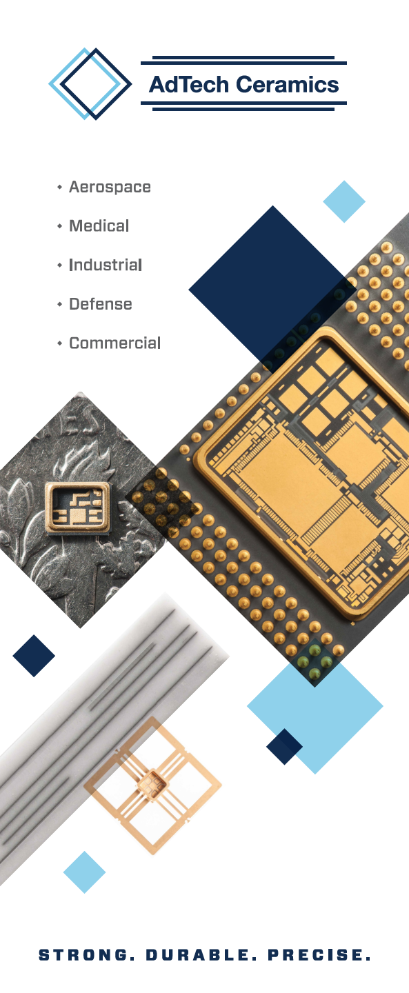
Widgets & Stone and 26 Tools worked together to craft new brand communications tools. Along with writing headlines and marketing messaging, the team proposed new graphic treatments and photo styles to reflect AdTech’s expertise.

Dotson Commercial photographed the impossibly small and detailed ceramics that the company makes. In order to capture the extreme precision and beauty of these pieces measuring just inches across, Dotson designed a custom lighting solution and used dark and light reflective services to highlight the materials in isolation. Extensive editing and retouching was required to remove some proprietary elements of the ceramics.

The creative team’s work is now providing the basis of a complete web overhaul being designed and built by Tubatomic.

Creative Direction: Mandy Meredith; Design: Mandy Meredith, Kerry O’Connor; Writing: 26 Tools; Photography: Dotson Commercial.

Tags adtech, hi tech ceramics, brand design, writing, messaging, photography, Dotson Commercial, 26 tools, Tubatomic, Widgets & Stone, design

Working Together Works

November 3, 2014

Working Together Works

EPB 2013-14 Annual Report

EPB’s mission is to enhance the quality of life in Chattanooga, TN by providing top-quality energy and communications services to the city. Each year the company issues an annual report and, naturally, it covers pertinent business and financial information but EPB also uses the report to tell stories of the great work being done by their employees.

Widgets & Stone teamed up with regular collaborators 26 Tools, Dotson Commercial and Tubatomic to build the all digital annual report. After meeting extensively with the EPB team (led by VP Danna Bailey), the creative team met to brainstorm how best to tell the stories of the past year.  Inspiring ideas came by starting with design, writing and photography solutions the team had wanted to use in the past, but had not had the opportunity to implement. The final style of the annual report is a perfect blend of solutions contributed by every member of the team – photography, typography, writing and interface. 

Building on the design styles established by Widgets & Stone, Tubatomic made the site adaptive – working differently on laptops than on tablets and smart phones. PDF versions of the annual report and the financials reflect the overall style while adapting it for yet another format.

Visit the actual site here.

Creative Direction: Paul Rustand, Mandy Meredith; Writing: Caleb Ludwick; Design: Bradley Dicharry, Travis Hitchcock, Kerry O’Connor; Web design + buildout: Tubatomic; Photography: Dotson Commercial.

Tags Tubatomic, 26 tools, Dotson Commercial, Widgets & Stone, annual report, design

The Love of the Ride, in Gear

September 18, 2014

The Love of the Ride, in Gear

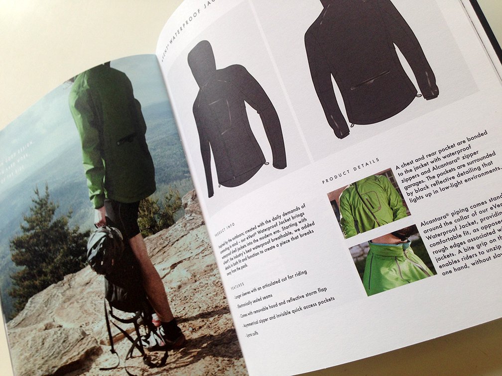
Escadrille’s first catalog

Escadrille is named after a “little squadron” that fought in World War I. They are a challenger brand setting out to make the world’s best apparel for cyclists. They are seeking to bring the form, function and freedom that cyclists want – both on and off the bike.

After initially struggling to find a voice that matched the look and feel of the brand, they turned to Caleb Ludwick (26 Tools) to help write their introduction to the world: the very first catalog. The hitch was — it needed to be done in two weeks.

Widgets & Stone jumped in to help with design, working with photography and product rendering assets to create a functional and memorable catalog. In short order, Mandy Meredith and Paul Rustand helped to produce a small of run of digitally printed catalogs for Escadrille’s first sales trip.

Creative Direction: Mandy Meredith; Design: Mandy Meredith, Paul Rustand; Writing: Caleb Ludwick; Printing: Bennet Graphics.

Tags escadrille, cycling apparel, catalog design, writing, 26 tools, Caleb Ludwick, Mandy Meredith

Streaming Made Simple

August 6, 2014

Streaming Made Simple

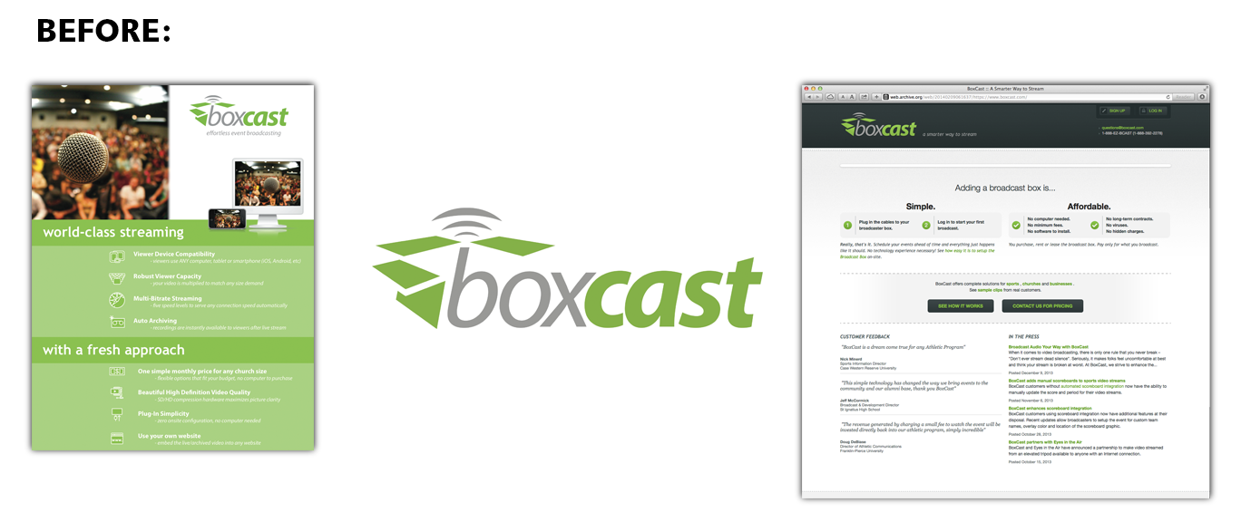
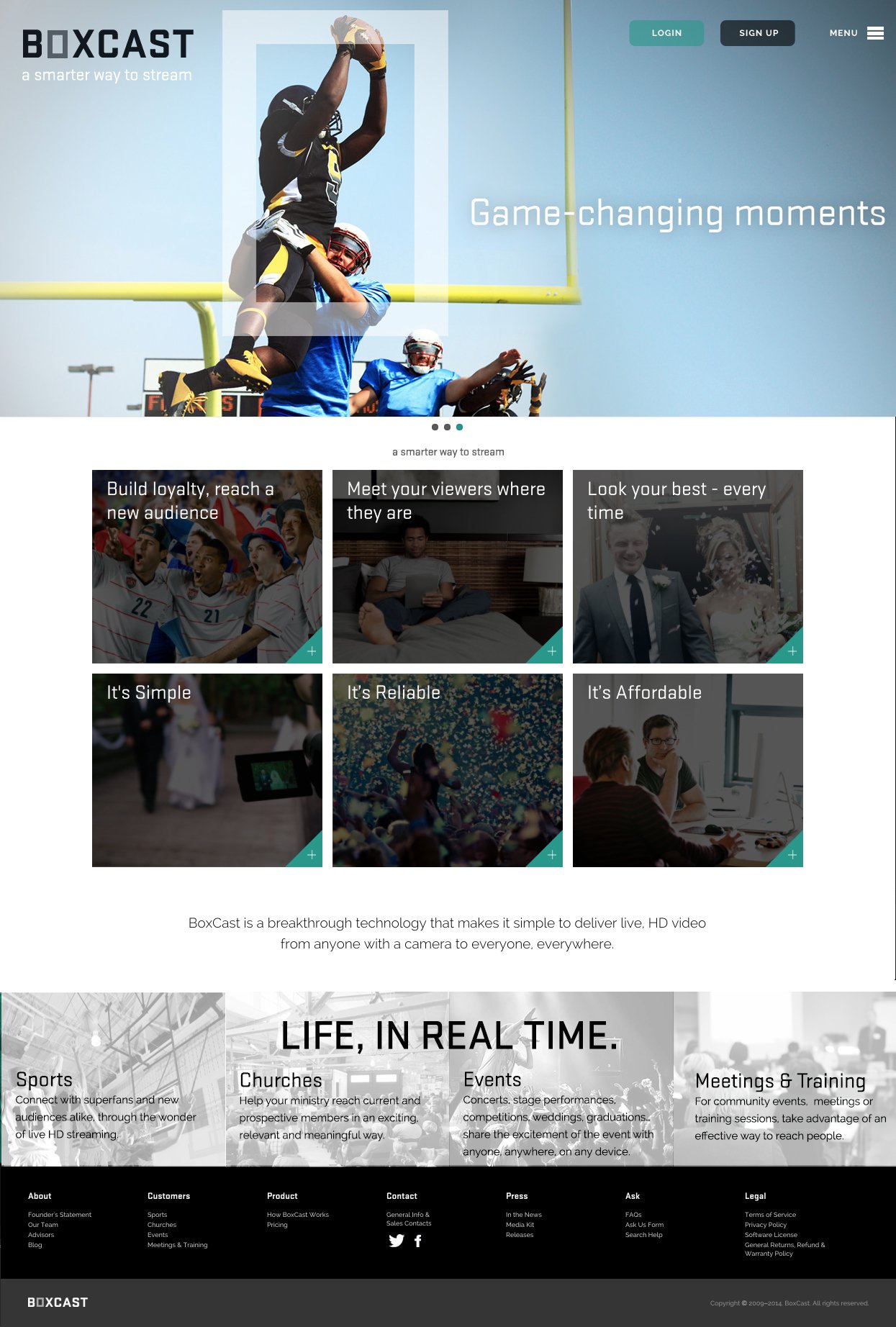
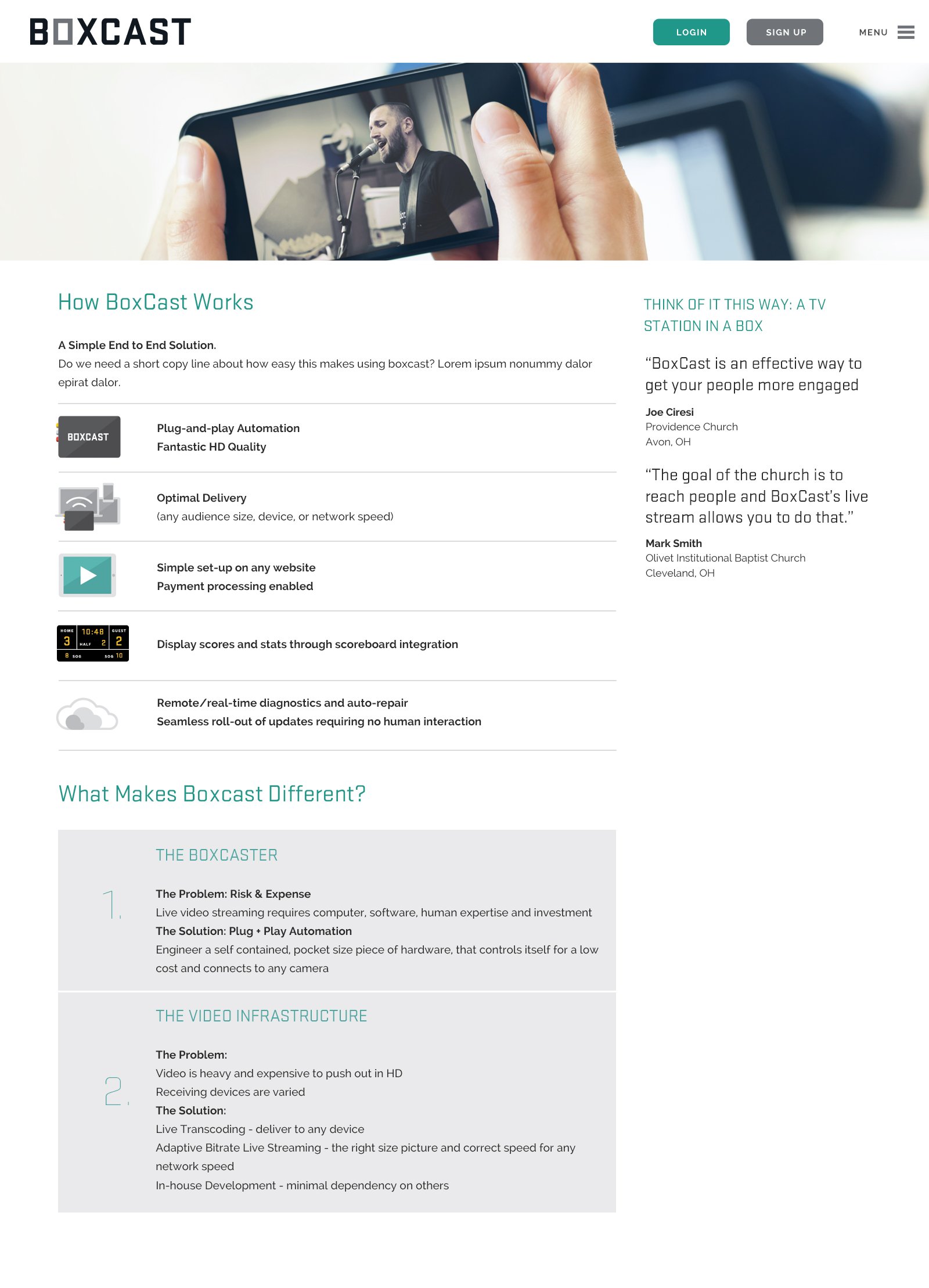
Boxcast: Live HD Video, from Anyone to Everyone

Boxcast is a pocket-sized breakthrough technology that makes it simple for anyone, anywhere to stream live video to everyone, everywhere.

Boxcast is a startup with a few years already under its belt. The company’s leadership was finding that the brand identity and communications materials it had created early on weren’t quite doing the job. So a couple of their experienced investors turned to Widgets & Stone for help.

Led by Mandy Meredith and Paul Rustand, the team also pulled in writer and strategist Caleb Ludwick of 26 Tools. The team quickly and efficiently produced several possible solutions for identity and communications, resulting in a clean, clear and straightforward look and feel.

Along with identifying five key target audience archetype stories, and ways to speak to those audiences, Widgets & Stone and 26 Tools created a new logo, design styles, photography guidelines, strap lines, headlines and explanatory copy.

Web designers Alex Ogle and Jason Fritts of Tubatomic joined in to establish web styles and templates for the client to implement.

“I have seen many presentations by nationally renowned creative agencies over the years,” said investor Tobey Maloney, “But this was by far the most impressive. The quantity and quality of concepts delivered on the timeline and budget was spectacular.”

Tags Caleb Ludwick, 26 tools, design, identity, Brand design, writing, BoxCast, rebrand, Widgets & Stone

Collective Action Drives Change

April 3, 2014

Collective Action Drives Change

Benwood Foundation Rebrand 

The Benwood Foundation has long been a “silent giant,” bringing a wealth of insight, knowledge, and generosity to the community it serves. With a new President and strategic plan in place, its Trustees decided that the time had come for the foundation to step out front, in a leadership role. Asking brave questions, funding Betas, and sharing risks.

Widgets & Stone, along with collaborators 26 Tools and Tubatomic, were asked to help position this shift, through messaging and a strategic web rollout of their new identity. Building upon a presentation of education research that we developed in 2013, we helped redesign the foundation as a convener of challenges, and the table around which people gather to move forward.

The new identity design was based on a straightforward, honest and plainspoken personality. Clean and simple typography based on a basic grid system, with hints of color applied sparingly to accentuate photo-journalistic black and white photography by Dotson Commercial.

When it came to the web site we thought: why not a new kind of homepage? Rather than just presenting projects and priorities, benwood.org is a living dialogue between 15 community members who represent all corners of the city – and are working in key areas. Engaged to point to real community needs as well as encouraging progress, these writers are sparking conversations about what is, and what’s possible. With new articles posted every 2-3 days, the home page is quickly becoming a hub not just of hope, but of connection and actionable insights.

See more images on Behance.

Creative Direction: Paul Rustand, Mandy Meredith, Caleb Ludwick, George Bairaktaris. Design Direction: Mandy Meredith, Paul Rustand; Design: Ben Dicks, Amy Trumbull, Nick Turner; Photography: Grant Dotson; Web Design: Alex Ogle, Brian Wleklinski.

Tags 26 tools, Tubatomic, Dotson Studios, Dotson Commercial, identity design, brand design, rebrand, Benwood Foundation, Widgets & Stone, web redesign

On the Node

September 17, 2013
View fullsize tumblr_mtabrqnGNb1rxp6kio2_1280.png
View fullsize macbook-air-ipad-mini-office-environment(1).png
View fullsize tumblr_mtabrqnGNb1rxp6kio4_1280.png
View fullsize interior-designer-working-space.png
View fullsize tumblr_mtabrqnGNb1rxp6kio5_1280.png
View fullsize tumblr_mtabrqnGNb1rxp6kio10_1280.jpg

Brand & Communications Strategy

Variable creates platforms that make the real digital, and make the digital real. Variable is also a leading developer of wireless sensing technology, NODE. 

NODE is a Kickstarter success story, turned hardware development company. They are a listening company, a learning company. Experts and innovators. PhDs and MBAs. Users and rethinkers of technology.

NODE’s target market is shifting and expanding, and it is more important than ever that they have a unified and consistent message about who they are, what they do, and why it matters.

Variable’s new CBO Jonathan Bragdon approached the creative partnership of Widgets & Stone, 26 Tools and Tubatomic to help craft a brand and communications strategy for the next phase of the company’s growth.

The team built on the solid identity (created by D+J Brand Consulting) to expand the kit of design and communications tools — with new writing, new photography, a new brand hierarchy and new web tools. Utilizing both broad and narrow strategies: appealing to gadgeteers who can help expand how NODE is used, or to very specific markets in color matching.

“At Variable, we make sensory platforms that connect apps and smart devices to the real world, in new ways. 

NODE is a hardware platform, that transforms how apps let us make sense of the world.” 

Creative Direction: Paul Rustand, Mandy Meredith; Design: Mandy Meredith, Paul Rustand, Brad Dicharry; Communication Strategy/Writing: Caleb Ludwick; Photography: Grant Dotson; Web Design: Tubatomic.

Tags NODE, Variable, Widgets & Stone, Brand Strategy, design, photography, web design, writing, Tubatomic, 26 tools, Caleb Ludwick, Dotson Studios

Latest Posts

1433 Williams Street, Chattanooga, TN 37408
+1 423-266-2221    info@widgetsandstone.com
A Whiteboard Company