• About
  • WHITEBOARD
  • Archive
  • Contact
Menu

widgets & stone | Graphic Design and Branding Agency in Chattanooga, TN

  • About
  • WHITEBOARD
  • Archive
  • Contact

The Making of an Icon

October 19, 2022
View fullsize Icon-LV.jpg
View fullsize Icon-Colors.jpg
View fullsize Icon-Details.jpg
View fullsize Icon-Green.jpg
View fullsize Icon-IFC.jpg
View fullsize Icon-Night.jpg
View fullsize Icon-Arbor.jpg
View fullsize 2022 NRS Mockup-3.png

The Making of an Icon

Catalog Design

ICON Structures are designed with the same care as architectural and fine art structures, and needed a catalog that helps pronounce that. Bold, colorful photography and vibrant, red typography lead readers through a streamlined narrative of featured products, style guides, and more.

Design Direction: Liz Tapp; Art Direction & Design: Emily Ricks.

Tags catalog design, print design, Widgets & Stone, Icon

Start Your Ascent

October 12, 2022
View fullsize H3LIUM_brandguide-02.jpg
View fullsize H3LIUM_brandguide-04.jpg
View fullsize H3LIUM_brandguide-08.jpg
View fullsize H3LIUM_brandguide-07.jpg
View fullsize H3LIUM_brandguide-16.jpg
View fullsize H3LIUM_brandguide-13.jpg
View fullsize H3LIUM_brandguide-24.jpg
View fullsize H3LIUM_brandguide-20.jpg

Start Your Ascent

H3LIUM Brand Design

H3LIUM is a Web3 native company with the mission of onboarding new builders and companies into the ecosystem to pursue unique fundraising opportunities — through creative services and unparalleled industry expertise. H3LIUM Studio is a full service creative agency with leading industry expertise in all things web3. Their team provides the highest quality creative offerings through in-house talent and represented artists.

The H3LIUM platform was the brainchild of the creators of the Balloonsville NFT collection. They saw great potential in expanding the types of collections they offered, as well as growing out their suite of services for others seeking to get into the sometimes confusing world of NFTs.

We helped guide them through the process of creating, naming and branding a new umbrella company that could house all the different kinds of products and services they were offering, and would offer in the future.

When it came to the design solution, our team thought a lot about the metaphor of flexibility or malleability — things being shape-shifting, scalable, adaptable. People who are interested in Web3 seem to have a shared interest in products and projects that are multidimensional and hard to categorize. They seem to fit whatever space is needed, much like the gas of Helium. The extreme thins and thicks in the type family embody this as well.

The final result is a design that embraces freedom and exploration, pushing boundaries to see what the worldwide web can actually be.

Creative Director: Paul Rustand; Art Director: Mark Walter; Designer: Noah Marlowe.

Tags NFT, Brand design, logo system, Identity Design, H3LIUM, Widgets & Stone

A Poetic Triptych

September 30, 2022
IMG_8013.jpg
IMG_2373.jpg
IMG_8041.jpg
IMG_8038.jpg
IMG_2372.jpg
IMG_8035.jpg

A Poetic Triptych

Volume Three for Viston Taylor

In 2010 our designer Grant Dotson created the look and feel for Viston Taylor’s first volume of poetry. A beautifully minimal book design built to showcase the poetry and to serve as a limited edition for friends and family. In 2017 designer Virginia Brooks built on the structure Grant designed for Volume Two, and finally in 2021 designer Emily Ricks completed Volume Three.

Creating Volume Three proved more difficult with supply chain issues and high demand on binderies. The unavailability of the same text paper used in Volumes One and Two meant that the printer, Adams Litho, had to get innovative — printing on plain paper to create the flecked stock effect of the older versions. Quality was paramount for the world class printers, and so production issues had to be overcome. The result is a beautiful set of three poetry books.

Viston Taylor, born February 5, 1946, was raised in a small town in Tennessee and, after serving in the U.S.Army in Vietnam, completed his 50-year career in gerontology and healthcare in Chattanooga, Tennessee.Now retired, he spends his days writing, reading, playing piano, and attempting to learn social media so that he can communicate with ten grandchildren. He is married 42 years to Roses, and they live on Lookout Mountain, Tennessee, where they happily play backgammon, cribbage, Scrabble, and gin rummy among three dogs, a cat, and a blue and gold macaw.

Creative Direction: Paul Rustand; Design: Emily Ricks and Grant Dotson; Printing and binding: Adams Litho.

Like Nana Makes

August 19, 2022
View fullsize Nana-LogoGrid.jpg
View fullsize final35.jpg
View fullsize NanaBs_Icons.jpg
View fullsize final34.jpg
View fullsize final30.jpg
View fullsize NanaBs_Illustration.jpg
View fullsize final36.jpg
View fullsize NanaBs_Logo.jpg

Like Nana Makes

Nana B's Brand Identity

A beloved brand of fresh sweet teas and lemonades with over 75 years of experience and history wanted to develop a new brand of single serve RTD teas. The marketing tream partnered with Widgets & Stone on naming, identity and packaging designs to launch the new drink. With a long history as a woman owned company, the final name of Nana B's was selected in honor of one of the original founders.

Widgets & Stone created dozens of designs for both the logo and the packaging in a wide variety of styles. The final solution is bright, distinctive and down-to-earth. The unique typography and playful illustrations capture the spirit of the New South and present the flavored teas in a cheerful and friendly style.

The product is currently being market tested in hopes of a national launch in the near future.

Creative Direction: Paul Rustand; Design: Travis Hitchcock, Liz Tapp, Mark Slawson, Brad Dicharry.

Connecting the Dots

July 28, 2022
View fullsize AI_BrandGuide-2.jpg
View fullsize AI_BrandGuide-4.jpg
View fullsize AI_BrandGuide-1.jpg
View fullsize AI_BrandGuide-5.jpg
View fullsize AI_BrandGuide-11.jpg
View fullsize AI_BrandGuide-9.jpg
View fullsize AI_BrandGuide-7.jpg
View fullsize AI_BrandGuide-10.jpg

Connecting the Dots

Applied Information Brand Design

Applied Information is a leading developer of connected, intelligent transportation system (ITS) solutions designed to improve safety, reliability and mobility. Their Glance Smart City Supervisory System™ allows cities to manage all their traffic and ITS assets on one web-based application. Their focus is in 5 key areas: Traffic Intersections, School Beacons, Parking Guidance System, Mobile Vehicle Assets and ITS devices. AI’s Glance TravelSafely™ smartphone app connects drivers, cyclists and pedestrians for a safer commute.

Creative Director Adam Houston (of Bridge Creative) has been working with Applied Information for years. Having watched AI grow exponentially over that time, he saw the need to take the company’s brand communications and design to the next level — to reflect the new maturity of the business. He asked us to help.

Our designers considered dozens and dozens of potential brand design styles before settling on three key approaches to present to the AI leadership team. The winning style is a visual metaphor of what Applied Information does: capture data from hundreds of thousands of smart devices and connect them to make everyday life better, safer and more effective.

Our solution is built around the theme of “Connecting the Dots” and uses a variety of image styles, patterns and designs made with dots large and small. The result is a diverse and flexible system that allows for integrated brand designs that run the gamut from simply clear to artfully complex.

Creative Direction: Adam Houston; Design Direction: Paul Rustand; Design: Brad Dicharry, Emily Ricks, Mark Walter; Photography: various stock.

Crafted by Hand

July 20, 2022
View fullsize 13SilverDollars_Illustration_Detail_1.jpg
View fullsize Grayton_2022_13SilverDollars_Square_Flat.jpg
View fullsize Grayton_2022_High&Mighty_Square_Flat.jpg
View fullsize High&Mighty_Illustration_Detail_1.jpg

Crafted by Hand

Labels for Grayton Beer

From the brew to the artwork, everything about Grayton Beer's latest special release is handmade the old way. Thirteen Silver Dollars Barleywine draws on the old-world tradition of American Barleywine. And if it wasn't patriotic enough, they put some of it away to age in bourbon barrels. And when it emerged, they called it High & Mighty.

The Florida brewery asked us to create hand-illustrated labels to bring these two country-song-inspired names to life. Art Director Mark Walter literally handcrafted the main components of the design in order to capture the essence behind the brewing techniques.

Art Direction & Design: Mark Walter.

Tags beer, beer labels, packaging design, Widgets & Stone, grayton beer, handcrafted, craft beer

The Full Spectrum of Learning

July 7, 2022
View fullsize mockup-of-a-macbook-pro-placed-on-a-white-work-desk-next-to-some-plant-pots-495-el.jpg
View fullsize illustrated-mockup-featuring-an-ipad-screen-and-a-gradient-background-2961(1) copy.png
View fullsize ipad-pro-mockup-of-a-girl-sitting-in-a-living-room-24791(1).jpg
View fullsize over-the-shoulder-view-mockup-of-a-man-using-an-imac-36832-r-el2(1).jpg
View fullsize mockup-featuring-a-woman-s-hand-holding-an-iphone-11-pro-over-a-neat-desk-2158-el1(1).jpg
View fullsize mockup-of-a-woman-working-on-a-macbook-and-writing-on-a-notebook-m12294-r-el2.jpg
View fullsize mockup-featuring-a-man-using-a-macbook-at-work-m11437-r-el2.jpg
View fullsize illustrated-mockup-featuring-an-ipad-screen-and-a-gradient-background-2961 copy.png
View fullsize mockup-of-a-woman-listening-to-a-podcast-on-an-ipad-pro-24792.jpg

The Full Spectrum of Learning

Lighthouse Kids Website

Lighthouse Kids is a children’s learning center that serves the Autism community at all varying stages of development. 

Lighthouse Kids approached us with an idea to build a website that can grow with the organization as more locations and internal developments emerge. The website needed to be a central hub for resources and connections for the Autism community, with a focus on functionality and usability for caregivers and physicians, alike. 

The website we designed and developed encourages community connection by inviting caregivers, family members, and career applicants, to engage with Lighthouse Kids events and discourse. Interactive forms across the site allow caregivers to communicate how and when they want to engage with the organization, while calendars encourage and guide connections within the Lighthouse Kids community. 

The Lighthouse Kids’ logo guided the direction of the design, from typography to color palette. A slab serif with playful terminals make a statement in large-scale titling, while thin sans serif Raleway body text synthesizes seamlessly with modern UI expectations.   

Handing over the reins to their new website, we equipped Lighthouse Kids with the tools and knowledge they will need to continue building their website as the organization develops and expands. 

Creative Direction: Paul Rustand; Design Direction: Liz Tapp; Design: Emily Ricks; Technical Support: George Bairaktaris.

Tags Lighthouse Kids, Autism, Education Center, Website, website redesign, design, Widgets & Stone

Not Your Run of the Mill

June 6, 2022
View fullsize MT-LogoBoard.jpg
View fullsize MT-SCT-Original.jpg
View fullsize CM-Logos.jpg

Not Your Run of the Mill

Brand design for Mill Town

The Standard Coosa Mill was once an icon of Chattanooga’s manufacturing might. Neglected at the heart of the Ridgedale neighborhood—a shell of the building has stood for decades, empty and in disrepair— a stark contrast to Chattanooga’s celebrated city center just two miles North East.

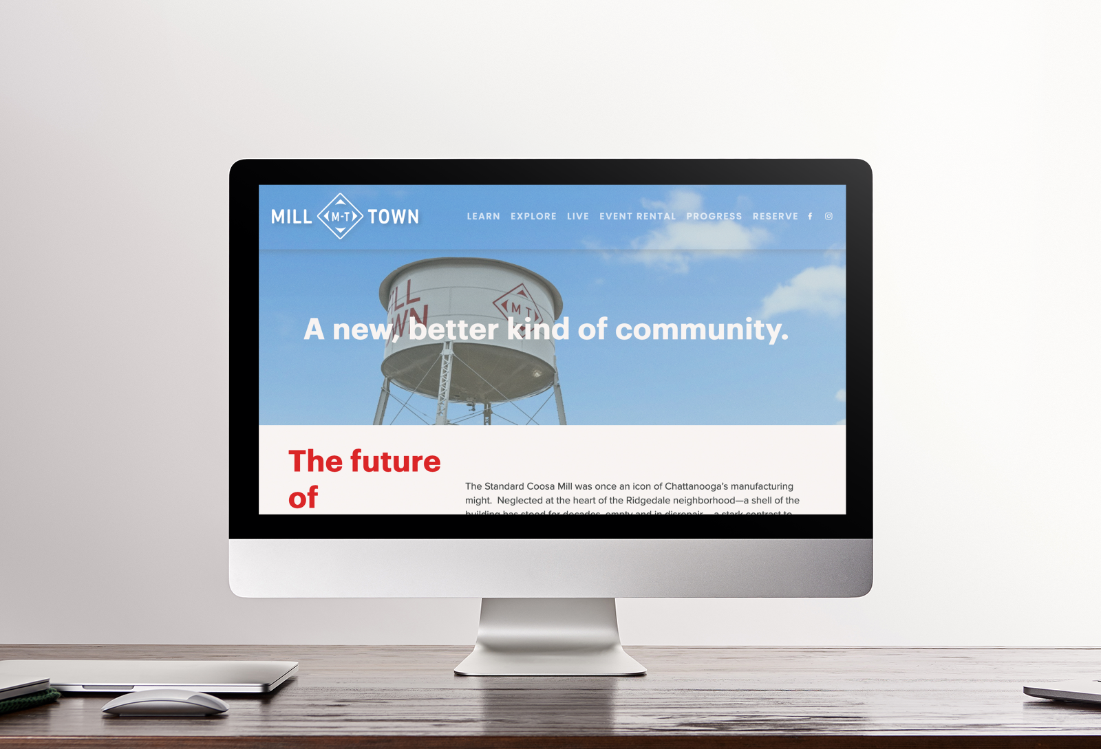
Benwood, Chattanooga Neighborhood Enterprise, and Collier Construction have formed a partnership that will soon revitalize this abandoned 20-acre parcel. Through a sustainable redevelopment model, Milltown will deliver a unique Mixed-Use and Multi-family community—boasting contemporary office space, ground-floor retail and dining, coffee, single family stand-alone homes and townhouses, community center, public plaza, green space, and more.

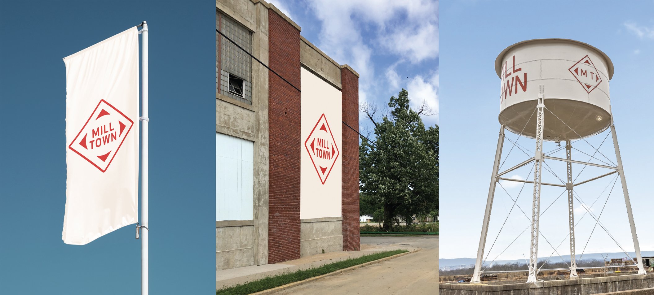
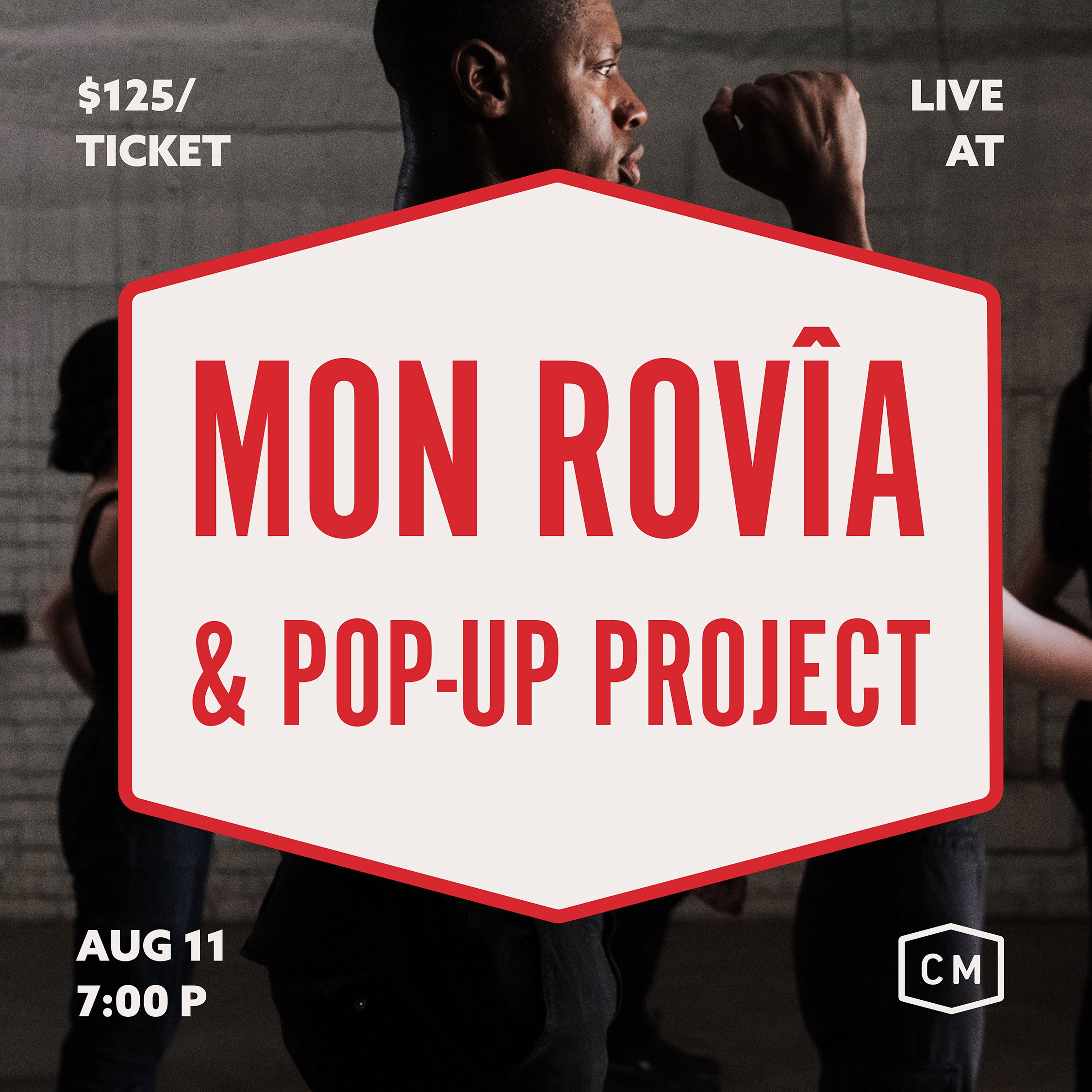
With a long history of partnering with Collier Construction, Matt Greenwell led the project to help name and brand the new development. The history of the place and the buildings helped provide inspiration both names — Mill Town for the development, Coosa Mill for the redesign of the factory — as well as for the design. The diamond shape of the now defunct Standard Coosa Thatcher Mill provided the foundation of the Mill Town mark. Bright bold colors and typography were selected to stand out in the environment.

Along with all the new homes being built in the Mill Town development is the anchor structure of the old factory, Coosa Mill. The refurbished water tower provided the inspiration for the abstracted enclosure of the Coosa Mill logo, which mirrors the geometry of the Mill Town logo.

While very much still a work in progress, the Mill Town identity is slowly beginning to take shape. Signage, wayfinding, promotion and web design are helping to build this new and exciting development in the heart of the city.

Learn more about Mill Town here.

Creative Direction: Paul Rustand; Design Direction: Matt Greenwell; Design: Matt Greenwell, Mark Slawson, Emily Ricks, Liz Tapp, Noah Marlowe.

Tags Widgets & Stone, Identity Design, brand identity, collier construction, development, Mill Town, Coosa Mill, Chattanooga TN

Concerts at Coosa

June 5, 2022
CM-AUG-11_Social-1x1_01.jpg
CM-SEPT17_Social-1x1.jpg
CM-OCT_1x1-Social2.jpg
CM-AUG-11_Social-1x1_02.jpg

Concerts at Coosa

Event branding

From September to November of 2022 Collier Construction is partnering with the Pop Up Project to host a series of immersive experiences in the iconic Coosa Mill factory building. Everything from an intimate candlelit opera concert to expressive dances to a massive immersive show covering three floors at once.

In addition to help brand Mill Town and Coosa Mill, Widgets & Stone helped to develop the look and feel for events and concerts being held in the old factory. The events are designed to gather the community in the Mill Town neighborhood while development plans for the building remodel are in progress. The idea is to get the public familiar with the building and the area while development is in progress. The hope is to use these events to introduce Mill Town to potential residents and businesses.

Widgets & Stone created campaign designs for posters, signage and digital promotions.

Creative Direction: Paul Rustand; Design: Emily Ricks.

Civiq Duty

May 18, 2022
View fullsize illustrated-mockup-featuring-an-ipad-screen-and-a-gradient-background-2961(2).png
View fullsize poster-mockup-hanging-in-a-minimalistic-setting-1245-el(1).png
View fullsize illustrated-mockup-featuring-an-ipad-screen-and-a-gradient-background-2961(1).png
View fullsize poster-mockup-hanging-in-a-minimalistic-setting-1245-el(3).png
View fullsize illustrated-mockup-featuring-an-ipad-screen-and-a-gradient-background-2961.png
View fullsize poster-mockup-hanging-in-a-minimalistic-setting-1245-el.png

Civiq Duty

Graphic Series

CIVIQ is a quarterly event hosted by the Chattanooga Design Studio, an independent non-profit community resource that promotes excellence in urban design through education, facilitation, and collaboration. The program introduces and humanizes national and international movements in urban design by showcasing visionary work being done by practitioners in other cities.

Widgets & Stone has been designing posters and promotional graphics for the program since 2019.

Creative Direction: Paul Rustand; Design: Athene Ruiz, Noah Marlowe, Stephanie Fast, Emily Ricks, Paul Rustand.

Tags poster design, CIVIQ Chattanooga, Widgets & Stone, chattanooga design studio, posters

Monkey See, MonkeDAO

May 4, 2022
View fullsize MonkeDAO_Final_Tshirt_mockup-183.png
View fullsize MonkeDAO_iPhone_Mockup_Final-01.png
View fullsize MonkeDAO_iPhone_Mockup_Final-02.png
View fullsize MonkeDAO_BrandStandards_Final_V2-02.jpg
View fullsize MonkeDAO_BrandStandards_Final_V2-03.jpg
View fullsize MonkeDAO_BrandStandards_Final_V2-06.jpg
View fullsize MonkeDAO_BrandStandards_Final_V2-09.jpg
View fullsize MonkeDAO_BrandStandards_Final_V2-12.jpg
View fullsize MonkeDAO_BrandStandards_Final_V2-17.jpg
View fullsize MonkeDAO_BrandStandards_Final_V2-13.jpg
View fullsize MonkeDAO_BrandStandards_Final_V2-08.jpg
View fullsize MonkeDAO_BrandStandards_Final_V2-16.jpg

Monkey See, MonkeDAO

New identity for the first NFT DAO on Solana

MonkeDAO is, the first NFT Decentralized Autonomous Organization (DAO) built on Solana cryptocurrency. The group works to provide unparalleled value to our members and the Solana ecosystem through community-led projects, connections and innovations. With the success of their initial NFTs (unique 8-bit Monkey portraits), the community is seeking to launch several new initiatives and needed a brand that could take them to the next stage of growth.

MonkeDAO built a culture that's quirky, fun, and irreverent, but also fairly bold — investing in the future of web3 while operating according to some pretty high libertarian ideals around rights to privacy, democratic processes, and the like. Kind of a fascinating collection of traits — playful, but also professional.

We wanted the visual impression of the brand to reflect that quirkiness—to feel quite bold and sure of itself while embracing some wonky, unconventional aesthetic decisions. The odd contrast in the logotype, the cheeky rotation of the "D", the use of color to create moments of high contrast, the heavy black lines in the icons—these decisions are all meant to feel quirky, but self-assured. Not subtle, but not wacky either.

Creative Direction: Paul Rustand; Design: Mark Walter.

Tags Widgets & Stone, brand identity, brand design, logo design, identity system, MonkeDAO, NFT, DAO, Solana

Well Hello Monty - Updated

April 26, 2022
View fullsize Screen Shot 2021-08-11 at 9.35.40 AM.png
View fullsize HelloMonty_GYC2022_Jan2022_285.jpg
View fullsize HelloMonty_GYC2022_Jan2022_607.jpg
View fullsize Hello Monty5.jpg
View fullsize haris-suljic-VpjPHuFAI-4-unsplash.jpg
View fullsize image_2021_08_11T16_57_33_864Z.png
View fullsize HelloNeon.png
View fullsize Hello Monty.jpg
View fullsize IMG_1419.jpg

Well Hello Monty - Updated

New Neighborhood Joint

A new restaurant and bar opened on the Southside in late 2021. Brothers Rob and Clay Gentry are Southside residents, Chattanooga natives, and have decades of experience in local brewing and restaurant operations. Rob owned The Blue Plate and ROBAR and is a co-founder of Big River Grille & Brewing Works, which was the first commercial brewery in Chattanooga post-Prohibition. Clay Gentry has been managing brewing operations and designing breweries for Big River restaurants across the country since the 1990s and has brewed professionally longer than anyone else in the city.

Rob has been one of our longest standing customers, letting us collaborate with him on a variety projects, including identities for The Blue Plate, Local 191, Localito 191 and ROBAR. With Hello Monty, we are excited to be part of creating a place that wants to become a gathering spot for the neighborhood – one that serves exceptional food and really, really good beer. The restaurant and beer logos are inspired by good old neighborhood restaurants and bars.

The names Hello Monty and Dynamo Brewing are nods to one of the city’s earliest proponents, B. “Rush” Montgomery. In the late 1800′s he declared that Chattanooga would one day be the “funnel of the universe!” The new restaurant is located on Main Street, which was originally named Montgomery Avenue after him.

As the restaurant design and build out continue to take shape, we are excited to grow and develop the identity design to reflect it’s personality. With a very talented brew master, a James Beard nominated chef, a menu featuring live fired food and a great space, Hello Monty won’t disappoint. Visit HelloMontyOnMain.com to keep up with this great neighborhood joint.

Read about our work on signage and interior graphics here.

Creative Direction: Paul Rustand; Design: John Le, Travis Hitchcock, Mark Slawson, Noah Marlowe; Photography: Graham Yelton and various stock sources.

Telling Stories that Matter

April 26, 2022
View fullsize Chattamatters-09.png
View fullsize Chattamatters-10.png
View fullsize Chattamatters-11.png
View fullsize Chattamatters-12.png

Stories that Matter

Chattamatters Visual Identity

Chattamatters is a brand new project from The Enterprise Center in partnership with The City of Chattanooga. Civic Storytelling Director, Mary Helen Montgomery, and Videographer & Motion Graphics Producer, Ian-Alijah Bey, have teamed up to lead the project. Pitched as a civic storytelling initiative, Chattamatters aims to "promote civic engagement and help residents understand some of the biggest issues facing our community (and how to address them)".


We worked with the Chattamatters team to design a visual identity that is bold and optimistic in tone, straightforward and approachable in execution. The visual strategy is meant to center the content and not the brand—to unite the series of stories with a cohesive aesthetic that does not complicate the user's experience.

Creative Direction: Paul Rustand, Design Direction & Design: Mark Walter.

Tags logo, logo system, visual identity, Identity Design, Widgets & Stone, Chattanooga

Better Together

April 7, 2022
View fullsize CFC-Alex.jpg
View fullsize CFCW-PURPLE.jpg
View fullsize CFC-Rich.jpg
View fullsize 2022Kit_Front_Blue-BG-2.jpg
View fullsize CFC-W.jpg
View fullsize 2022Kit_Front_Transparent-BG-3.jpg
View fullsize CFCW-NAVY.jpg
View fullsize 2022Kit_Front_Blue-BG.jpg
View fullsize CFCW-Green.jpg

Better Together

Chattanooga FC 2022 Uniform Designs

As the Chattanooga Football Club entered its 13th season (and third with a professional men’s team), the club announced that it would be relaunching the women’s team which had been discontinued in 2018. Widgets & Stone created designs to reflect the campaign theme of “Better Together.”

The club, in deep collaboration with the design team, landed on a set of designs that expresses both the unity and individuality of the two teams. Each design highlights the center of the jersey, whether with a dynamic split of two organic patterns or with the point of several chevron arrows. Each design is unique and connotes a sense movement, creativity and teamwork.

Both teams wear the same colors: navy and sky for the field players, green or purple for the keepers. One of the only two differences in the designs is in the navy kits: chevrons for the women, the split pattern for the men. The other key difference is the color scheme of the logo: the women use sky as the primary color, while the men flip and use navy instead.

The results are winners with the club and fans alike. Our hopes are that they will propel the teams to be winners on the field as well!

Creative Director: Paul Rustand; Designers: Emily Ricks, Mark Walter, Noah Marlowe; Photography: Ray Soldano.

Tags soccer, kit design, uniforms, jerseys, chattanooga fc, Widgets & Stone

To the Rescue

February 18, 2022
View fullsize 676560291923935232_2.jpg
View fullsize 676560291923935232_3.jpg
View fullsize 676560291923935232_1.jpg

To the Rescue

Logo for Brindlee Mountain Fire Apparatus

In 2000 volunteer firefighter James Wessel helped his local fire department purchase a used firetruck. When the truck broke down on its very first call to a house fire and the house was lost completely, they went back to the salesman who brokered the deal looking for compensation. As it turned into a lengthy legal battle, James decided that he could do better. He founded Brindlee Mountain Fire Apparatus in 2001, buying, fixing and selling one fire truck that first year.

In the twenty plus years since then, the company has grown by leaps and bounds — buying, fixing and selling hundreds and hundreds of vehicles every year. But as the company’s reputation and brand equity has grown, the original logo began to lag behind, not adequately expressing their integrity and expertise.

After a failed attempt at logo redesign a few years ago, we were asked to come the rescue. We created a new logo that embraced their rich heritage but also would take them into the next era of growth. We developed a flexible logo system that could accommodate all the many applications: digital, print, apparel and more.

Creative Direction: Paul Rustand; Design: Mark Walter; Illustration: David Webb.

Tags firetruck, logo, logo design, Brindlee Mountain Fire Apparatus, buy fix sell, Chattanooga TN, Widgets & Stone

Going the Extra Mile

February 18, 2022

Going the Extra Mile

Reliance Partners Environmental Graphics

Reliance Partners helps provide trucking insurance for freight companies – whether they have just one truck or as many as a thousand. The company’s philosophy of going the extra mile for their customers is paying off in dividends and Reliance is growing. So much so that the company has moved into a much larger facility, building out a couple floors to make room for all their employees.

The architects and interior designers at Franklin Architects tapped us to create interior and environmental graphics to bring the Reliance brand to life in the new space. Working closely with COO Laura Ann Howell, our team created signs, window treatments, break room graphics, and “instagram-able scenes” throughout the office.

The end result goes the extra mile to reinforce the Reliance brand in the contemporary professional setting, while adding dynamic visuals to the decor.

Creative Direction: Paul Rustand; Design Direction: Liz Tapp; Design: Mark Walter.

Tags Reliance Partners, Widgets & Stone, environmental graphics, signage, instagram-able, wall graphics, mural, illustration

Spec-tacular Building

February 17, 2022

Spec-tacular Building

Brimstone Builds Logo

As Nashville and the surrounding region have continued to grow in population, a new spec home building company saw an opportunity to grow as well. Brimstone Builds sought out Widgets & Stone to create a new logo to help them compete in the market.

Our solution is far from cookie-cutter and is built to last for many, many years.

Creative Direction: Paul Rustand; Design: Mark Walter.

Tags construction, home builders, spec homes, logo, logo design, Widgets & Stone, Brimstone Builds

Be Green, Be Good

January 21, 2022

Be Green, Be Good

Green for Good Logo

The Green for Good idea was spawned from Startup Week CHA, in which entrepreneurs were invited to pitch ideas to the city for ways to inspire better recycling practices. Brian Wright’s Green for Good was one of four ideas chosen by the city and awarded grant money to pilot the program and assess the results.

The Green for Good concept is a threefold plan: identify fun, inventive ways to recycle in the home, school, and at work. Businesses and organizations on the Southside that will be participating in the pilot program for the month of January. The Green for Good team will be collecting the recycling on a weekly basis.

Proceeds from the collections will benefit Habit for Humanity. Each participating business will compete to win a Green for Good prize pack.

Widgets & Stone donated a logo to help the cause get off to a good green start.

Creative Direction & Design: Paul Rustand.

Tags Green for Good, Widgets & Stone, Chattanooga TN, logo, recycling

Tinkering with Space, Online

January 19, 2022

Tinkering with Space, Online

Web site for Tinker Ma

Tinker Ma offers clients their more than 60 years of combined expertise in architecture and design. The name is a play on words, as architects tinker with space (‘ma’ is japanese for “space”). Widgets & Stone created the adaptive logo and identity system for the firm in 2019, and returned to help build a functional and dependable web site in 2021.

Tinker Ma is prolific, with many team members producing many projects around the southeast. With their old web site, they could not update it themselves and had to rely on developers to do it for them, and as a result, the site did not showcase newer work. We set them up on a new platform and gave them a tutorial on how to add and change information themselves, allowing Tinker Ma to stay up to date.

Visit the web site.

Design Direction: Liz Tapp; Design: Liz Tapp, Noah Marlowe; Photography: provided by Tinker Ma.

Tags tinker ma, Widgets & Stone, web design, architecture

A Good Business

December 17, 2021

A Good Business

Relationship Business design identity

Relationship Business is the latest endeavor of Goodstory (and Counsel Creative) founder, Kenny Morgan. As a writer, podcaster, and coach, Morgan champions a message of people-over-profit—relationships before business. Keen for a fresh perspective, Kenny asked Widgets & Stone to build a flexible visual identity to unite his many projects. The resulting system hinges on a versatile typographic strategy softened by a nature-made color palette and hand-drawn flourishes.

Be sure to keep an out eye for the book and the podcast as they roll out in the coming months!

Design Direction & Design: Mark Walter; Photography: Goodstory.

Tags Relationship Business, Kenny Morgan, Brand identity, brand design, identity design, publishing, book design, social media design, Widgets & Stone
← Newer Posts Older Posts →

Latest Posts

1433 Williams Street, Chattanooga, TN 37408
+1 423-266-2221    info@widgetsandstone.com
A Whiteboard Company