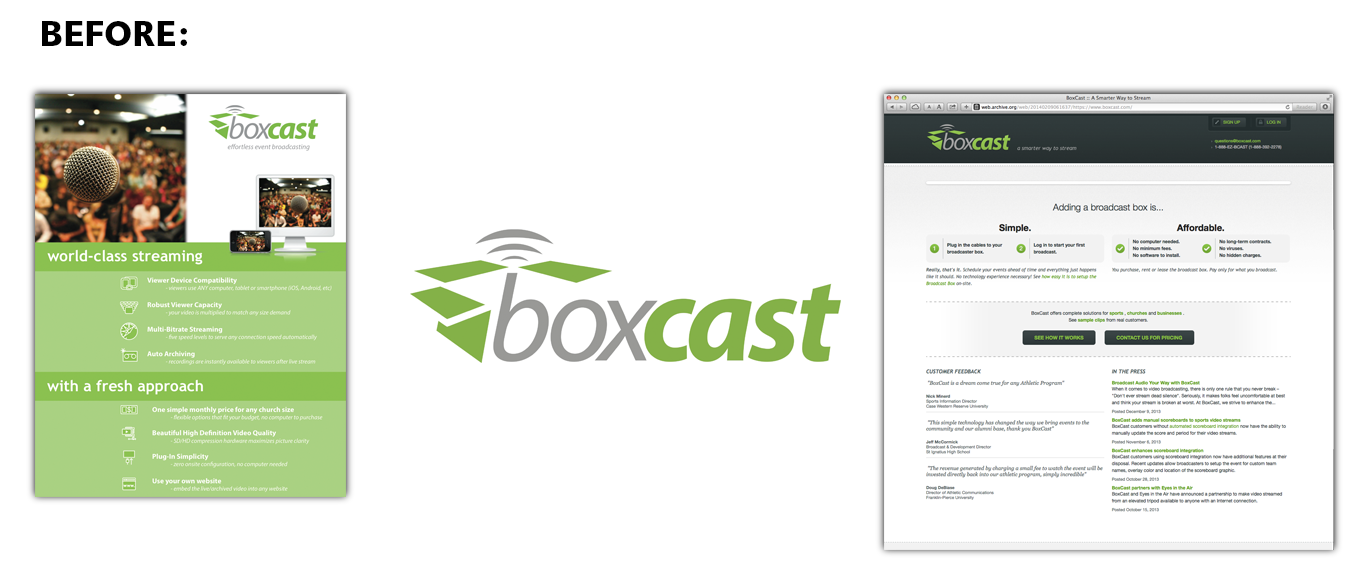
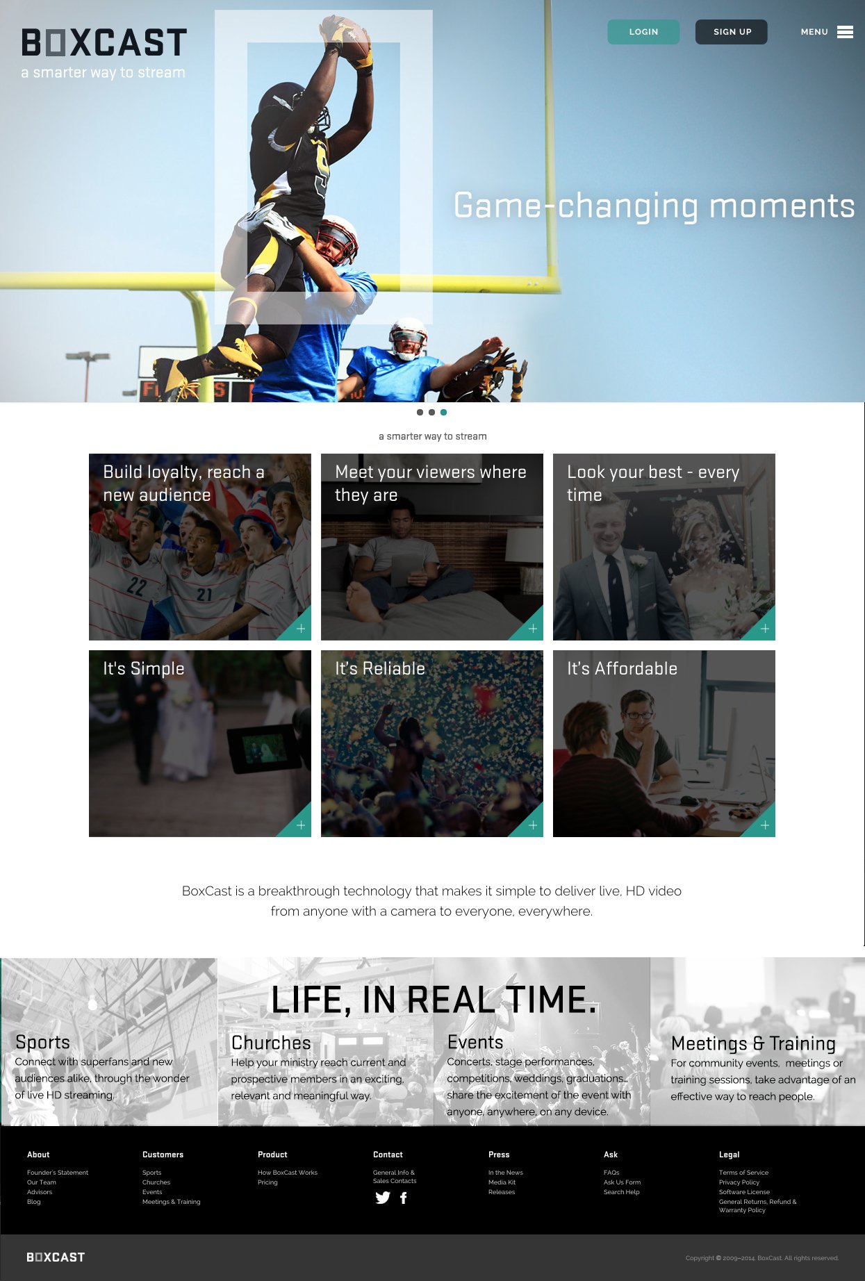
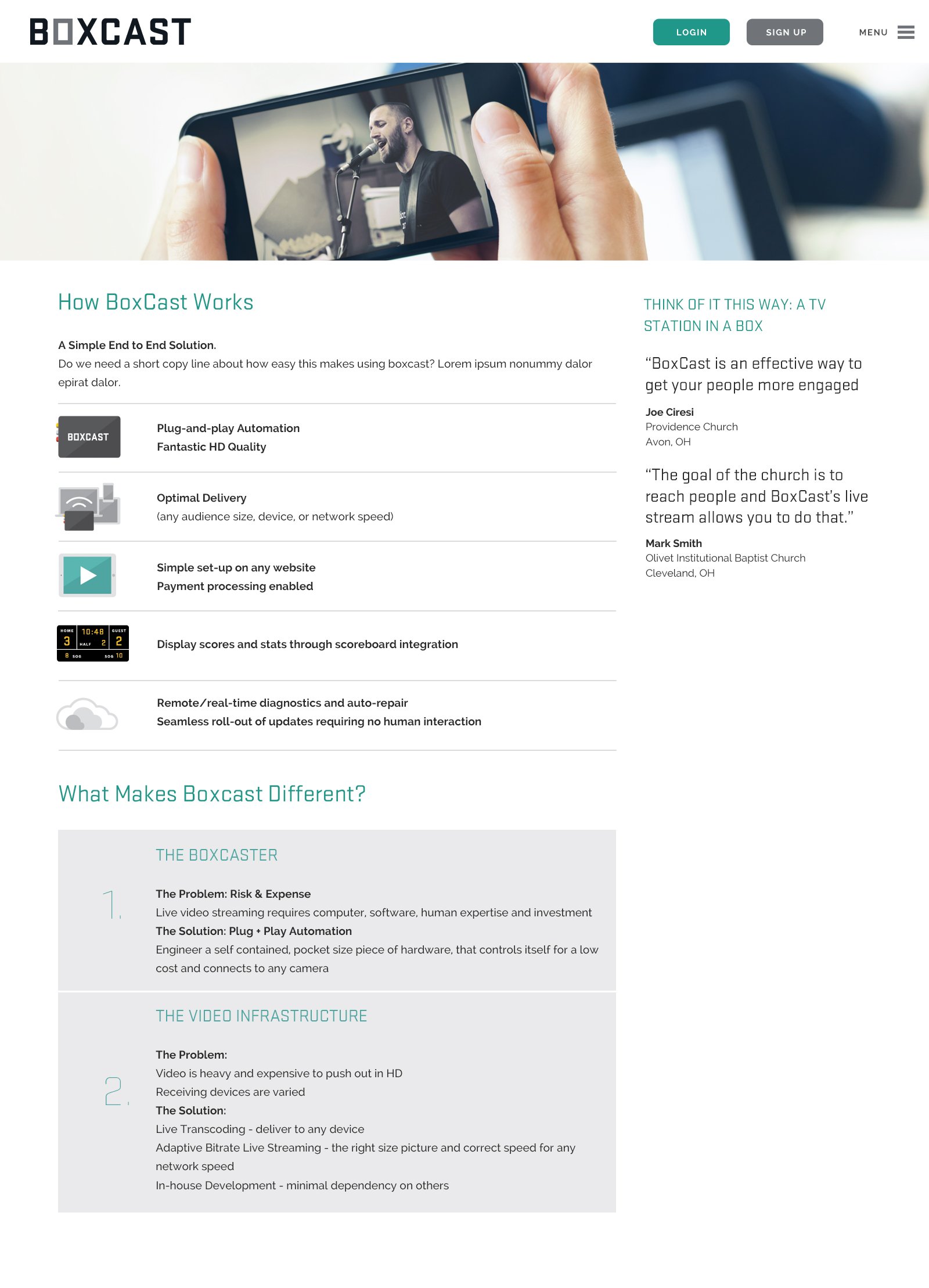
Streaming Made Simple
Boxcast: Live HD Video, from Anyone to Everyone
Boxcast is a pocket-sized breakthrough technology that makes it simple for anyone, anywhere to stream live video to everyone, everywhere.
Boxcast is a startup with a few years already under its belt. The company’s leadership was finding that the brand identity and communications materials it had created early on weren’t quite doing the job. So a couple of their experienced investors turned to Widgets & Stone for help.
Led by Mandy Meredith and Paul Rustand, the team also pulled in writer and strategist Caleb Ludwick of 26 Tools. The team quickly and efficiently produced several possible solutions for identity and communications, resulting in a clean, clear and straightforward look and feel.
Along with identifying five key target audience archetype stories, and ways to speak to those audiences, Widgets & Stone and 26 Tools created a new logo, design styles, photography guidelines, strap lines, headlines and explanatory copy.
Web designers Alex Ogle and Jason Fritts of Tubatomic joined in to establish web styles and templates for the client to implement.
“I have seen many presentations by nationally renowned creative agencies over the years,” said investor Tobey Maloney, “But this was by far the most impressive. The quantity and quality of concepts delivered on the timeline and budget was spectacular.”