• About
  • WHITEBOARD
  • Archive
  • Contact
Menu

widgets & stone | Graphic Design and Branding Agency in Chattanooga, TN

  • About
  • WHITEBOARD
  • Archive
  • Contact

A Bright Start

November 12, 2021

A Bright Start

BrightBase Identity Design

BrightBase Management was founded by the grandson of what is now known as Republic Parking Services. With over 50 years of combined experience, the BrightBase team serves the Chattanooga area with a southern charm that is wise and welcoming.

As an new entity, BrightBase needed branding that reflected the expertise and insight that accompanies decades of management experience, while capturing the loyal, neighborly essence to be expected of a Chattanooga local’s entrepreneurial venture. Widgets & Stone helped guide the new company through naming and identity design. The typographic logomark, the brand’s jumping off point, subtly connotes driving lanes or parking lines, while grounding itself with a highly legible sans serif font.

The website guides customers and potential employees with bold buttons and simple drop-down menus. BrightBases’ web presence is so instinctive, a user could navigate it while driving—though we don’t recommend it!

Creative Direction: Paul Rustand; Design: Brad Dicharry, Emily Ricks; Photography: Unsplash.

Tags branding, identity design, logo design, BrightBase, Widgets & Stone, Chattanooga, Parking management, web design

Growing the Mission Médicos

November 11, 2021

Growing the Mission

Médicos Mission Fund Logo and Identity

Clínica Médicos was founded in 2015 by Dr. Kelly Rodney Arnold to make quality, comprehensive healthcare accessible to Chattanooga’s underserved Latino community regardless of insurance status, language, pregnancy, age, or gender. In six short years, from their clinic at 1300 East 23rd Street, it has realized that mission by providing outstanding care and empowering the next generation of medical professionals through education and hands-on training.

Now, Clínica Médicos is growing. Dr. Arnold and her colleagues have acquired a new facility at 1148 East 23rd Street — a former automotive garage across from the Sculpture Fields at Montague Park — and will soon offer a fuller range of medical services, including mental health and counseling, dentistry, and more.

To bring this vision to life, they have created the Médicos Mission Fund, a new non-profit, 501c3 organization that will fund the growth of a new campus, outstanding educational experiences for our physicians and high-quality medical services and equipment for the families who rely on Clinica medicos.

Widgets & Stone helped to create a logo that pairs perfectly with the Clínica Médicos identity and dovetails into print materials as well.

Creative Direction: Paul Rustand; Design Direction: Liz Tapp; Design: Liz Tapp, Noah Marlowe; Photography: provided by the client.

Tags Widgets & Stone, Chattanooga TN, Clinica Medios, Medicos Mission Fund, branding, identity design, print design, logo

The Blue Plate

March 18, 2020

Breakfast, Lunch and Dinner

The Blue Plate

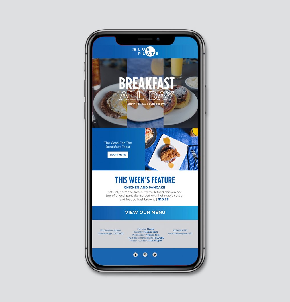
Since 2006, Widgets & Stone has helped to develop creative design and marketing tools for Chattanooga’s metropolitan diner, The Blue Plate. As the restaurant has grown and changed over the years, so has the branding. Widgets & Stone has designed styles and messages for digital, print, photography, interior design and so much more.

Let our team help you with your restaurant project.

Creative Direction: Paul Rustand; Photography: Graham Yelton; Design: Travis Hitchcock, Liz Tapp, Athene Ruiz, Laura Michael.

Tags design, restaurant design, branding, the blue plate, Widgets & Stone, logo, identity

A Better Business Paradigm.

January 22, 2020

A better business paradigm.

For-Purpose logo design

For-Purpose is a public benefit corporation founded by Josh McManus after 23 years of intensive study on making the world work for the most people possible. The company exists to equip people, build places, and create companies that strengthen humanity’s immune system.

For-Purpose seeks to help clients merge market imperatives and moral purposes. Their practical toolkit is designed to help companies, communities and leaders work toward a more just, resilient, and equitable world.

For-Purpose Founder Josh McManus tasked Widgets & Stone with creating a logo that could work as a registration or certification mark in conjunction with other company’s logos – like the ® or B-Corp symbols. Our design team came up with an efficient and minimal solution that works nicely in all kinds of applications.

Read more about Josh and For-Purpose here.

Creative Direction: Paul Rustand; Design Direction: Matt Greenwell; Design: Brad Dicharry.

Tags For-Purpose, logo design, trademark, certification, Widgets & Stone, branding

Inhabit

July 9, 2019

Inhabit

EF Contract Neocon Showroom 2019

EF Contract’s new products and showroom were inspired by the layers of the city. 

“Driven by the people who call it home and visitors alike, the city never sleeps—its layers, new and old, molded by the institutions, the artists, and the innovators. We’re charmed by the city’s grit, that on second glance is beauty.

It’s the taste of a craft brew, the song of a guitar that echoes from a local stage, the peeling posters lining the walls of an alleyway. This is what inspired us to step back and realize—how it’s the collective people inhabiting each city, adding these elements day by day, that slowly build a city’s unique texture, layer upon layer.”

Collaborating with EF Contract’s Susan Curtis, Widgets & Stone designed a simple and striking showroom.

Creative Direction: Paul Rustand; Design Direction and Design: Liz Tapp, Mark Slawson; Writing: Jacob Biba; Photography: Grant Williams; Print production: Adams Litho; Installation and fabrication: Range Projects.

Tags neocon 2019, EF Contract, Showroom design, branding, environment design, interior design, display design, signage

For Club, For Country

May 1, 2014
View fullsize tumblr_n4wfxoz1FX1rxp6kio2_1280.jpg
View fullsize tumblr_n4wfxoz1FX1rxp6kio3_1280.jpg
View fullsize tumblr_n4wfxoz1FX1rxp6kio4_1280.jpg
View fullsize tumblr_n4wfxoz1FX1rxp6kio5_1280.jpg
View fullsize tumblr_n4wfxoz1FX1rxp6kio6_1280.jpg
View fullsize tumblr_n4wfxoz1FX1rxp6kio1_1280.jpg

For Club, For Country

Chattanooga FC 2014 Campaign

As Chattanooga Football Club enters its sixth season in the men’s semi-pro National Premier Soccer League, it coincides with the summer of the World Cup – and the launch of the first season of the women’s team in the Women’s Premier Soccer League.

The campaign style utilizes illustrations (by Brian Woodlief based on photography by Steven Llorca) as there was no existing photography for the newly formed women’s team. The theme of “For Club, For Country” ties into the excitement of the biggest tournament of the world’s game — the World Cup in Brazil this June and July.

Creative Direction: Paul Rustand; Art Direction: Bradley Dicharry; Design: Ben Dicks, Travis Hitchcock; Illustration: Brian Woodlief; Men’s illustrations drawn from CFC photographer Steven Llorca.

Tags Chattanooga FC, branding, Illustration, design, posters, soccer, Brian Woodlief, Steven Llorca, Widgets & Stone

Latest Posts

1433 Williams Street, Chattanooga, TN 37408
+1 423-266-2221    info@widgetsandstone.com
A Whiteboard Company