
Chattanooga 2.0, a collective impact organization focused on education and workforce outcomes, set out to refine its messaging and redesign its look. Our goal was to clearly define the organization’s work, engage a range of audiences, and provide actionable pathways for involvement—all while addressing complex topics like literacy and equity with care and clarity.
Led by Strategist and Writer Benjamin Cake, our team laid out the following strategic goals:
Audience-Centered Communication: Developed tailored calls to action and navigation paths for each segment, prioritizing action verbs over labels to make engagement more intuitive.
Clarifying the Message: Created a unified definition of “literacy” and determined when messaging should reflect the broader mission versus specific initiatives.
Layered Engagement: Built pathways for different levels of user interest, including a potential deeper-dive section outside the main scroll of the webpage.
Equity-Focused Framing: Crafted messaging that highlighted systemic inequities while avoiding stigmatization of children and families from marginalized backgrounds.
Simplified Content and Clear Outcomes: Streamlined the site’s content to ensure visitors leave with a clear definition of literacy, an understanding of Chattanooga 2.0’s role, and a call to action.
Program Clarity: Differentiated between projects owned by Chattanooga 2.0 and those it supports.
Memorable Visual Identity: Updated design and photography styles to better engage audiences.


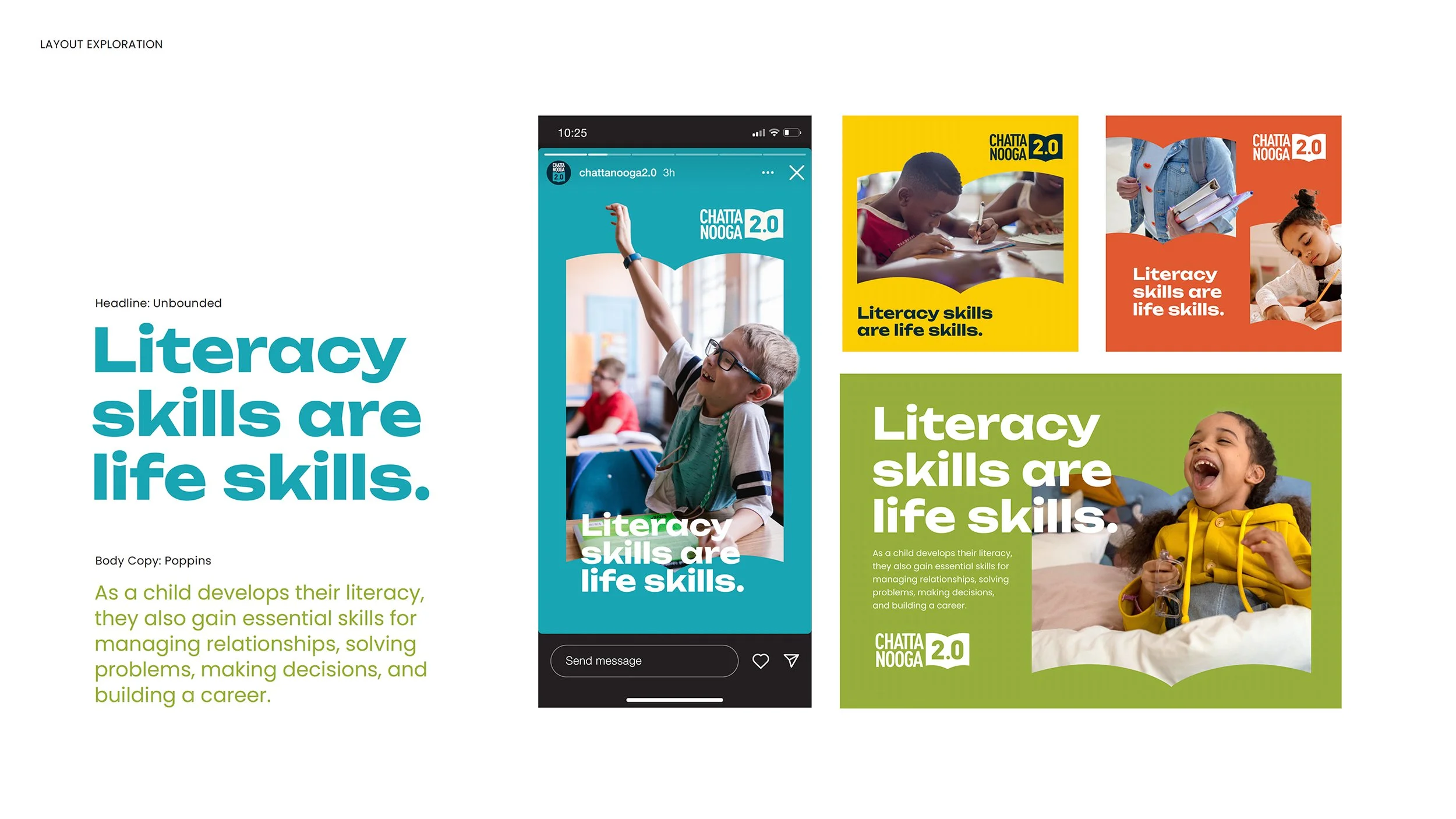
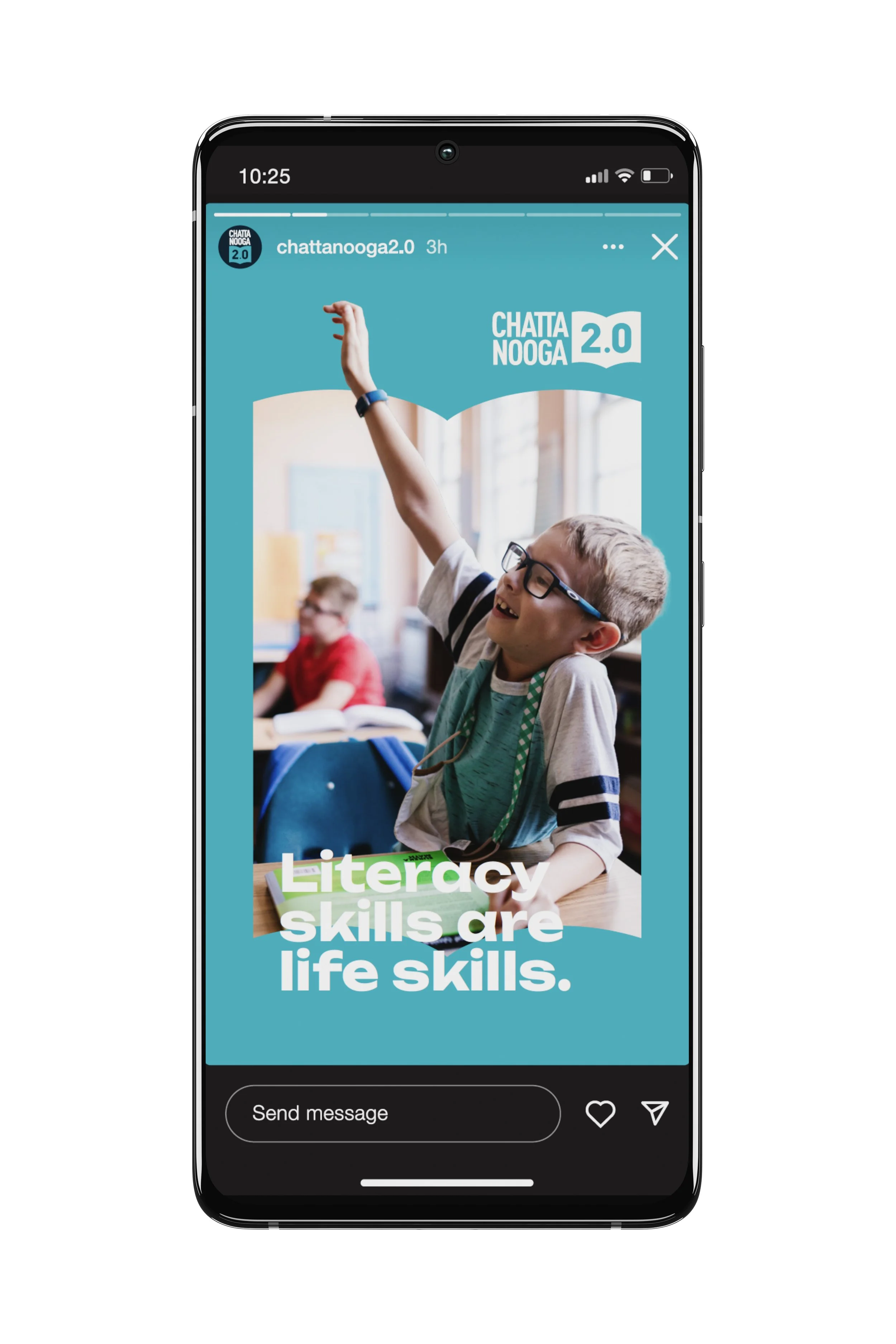
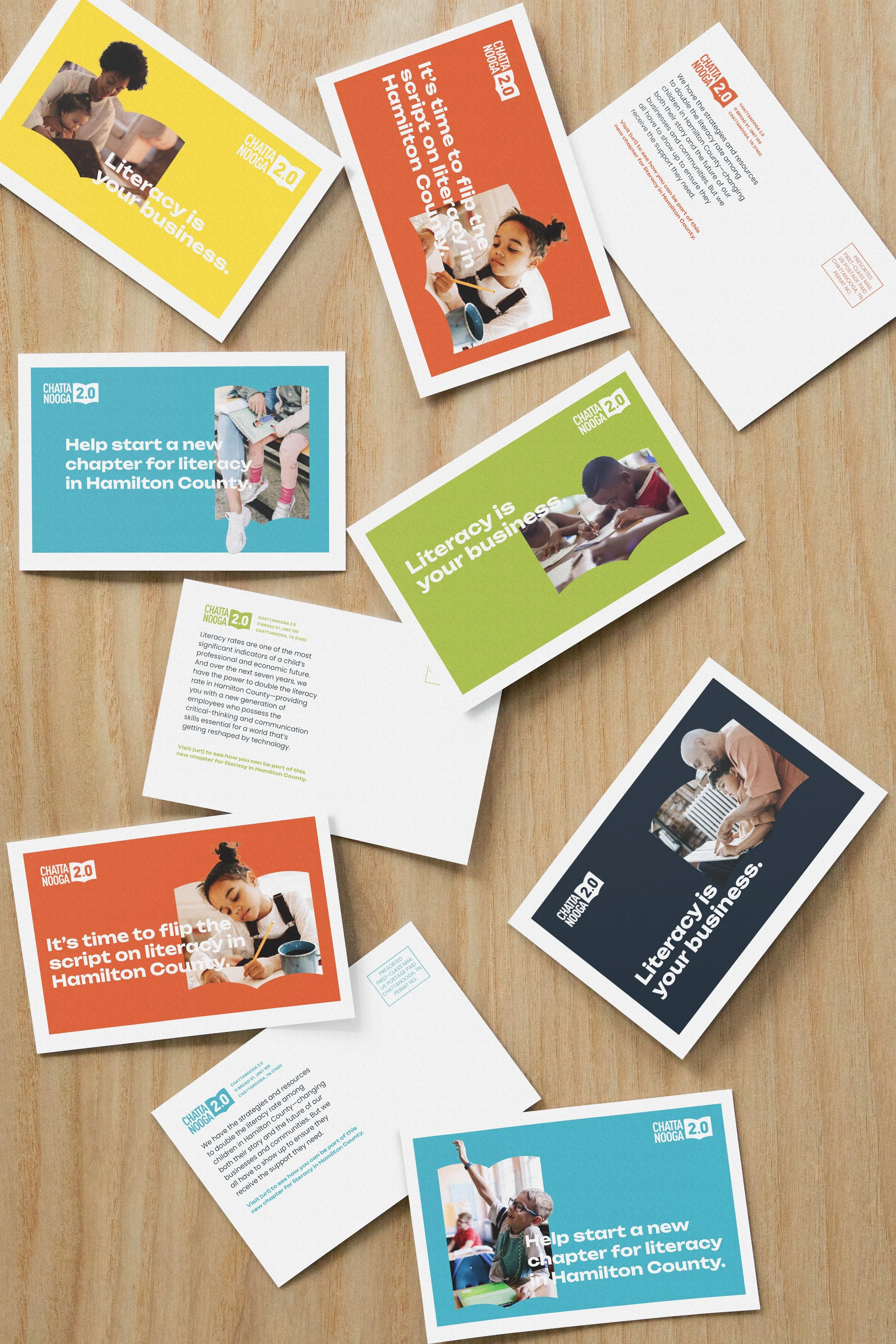
Since we had been involved with Chattanooga 2.0 at its inception in 2015 and with its redesign in 2020, we had great context for how to build upon the overall look and feel of the brand. Designer Travis Hitchcock and Design Director Liz Tapp expanded on the identity with a simple, but clever, visual style.
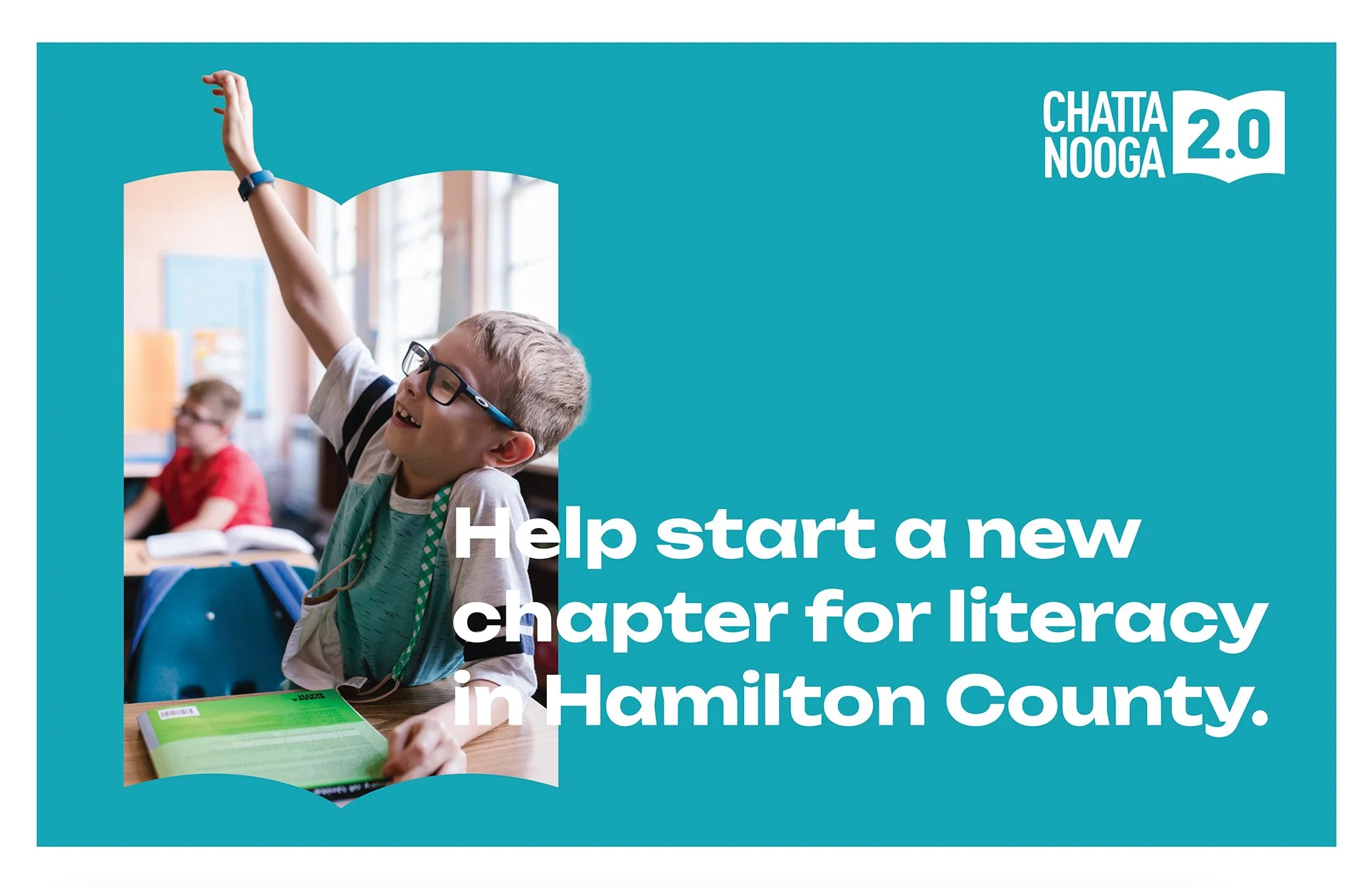
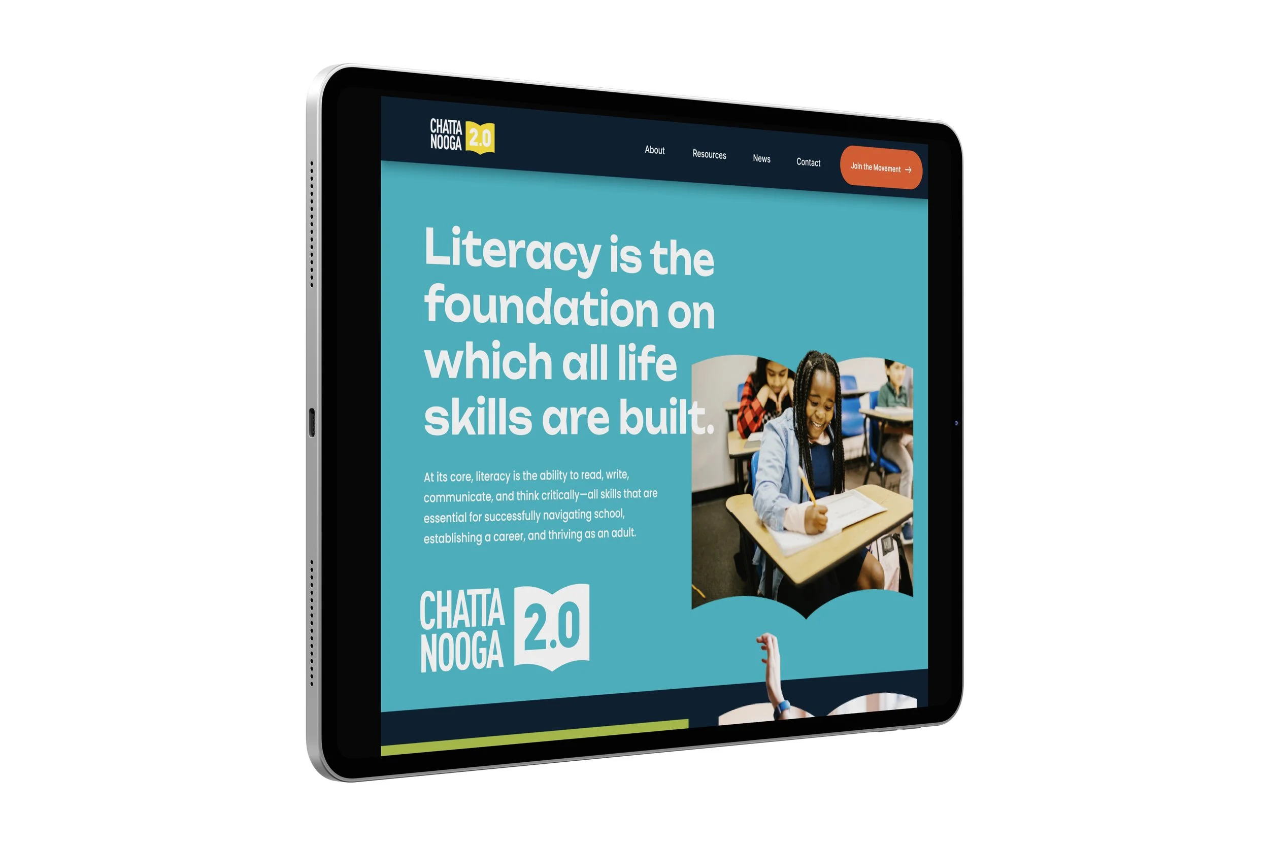
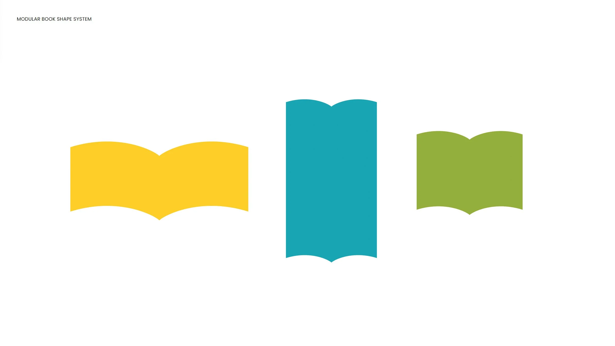
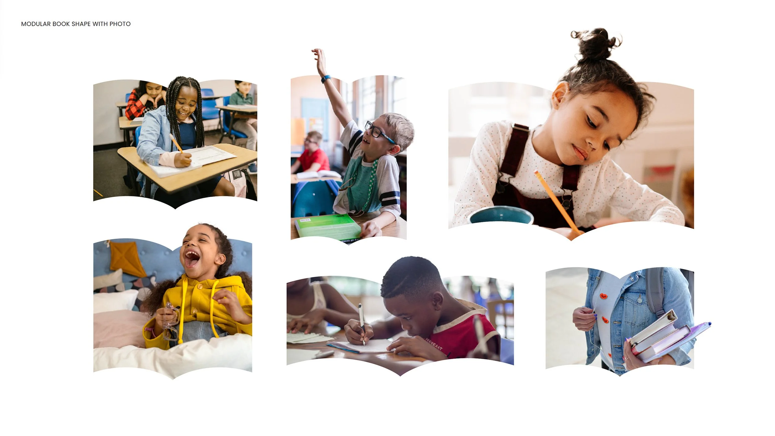
Using the book shape from the logo, and varying its height and width, they used it as a die-cut container for photography of kids — with some element of the photo breaking out of the shape. Combined with bright brand colors and quirky typography, the effect is simple but memorable.


The refreshed strategy and communications designs provide a clearer, more engaging experience for all users. The public now easily understands Chattanooga 2.0’s mission, see where they fit in, and are empowered to take meaningful action.
Communications Strategy & Writing: Ben Cake; Creative Direction: Paul Rustand; Design Direction: Liz Tapp; Design: Travis Hitchcock; Motion Design: Drake Rustand.