

In 1999, two designers and friends decided to collaborate together to benefit Chattanooga’s brand new Urban Art Institute in its fundraising auction. After some deliberation, they decided to create a letterpress limited edition using contrasting song lyrics. Lo/Fi was born out of that collaboration. Low/Fidelity — Select Cultural Lows and Critical Fidelities of Rock and Roll.


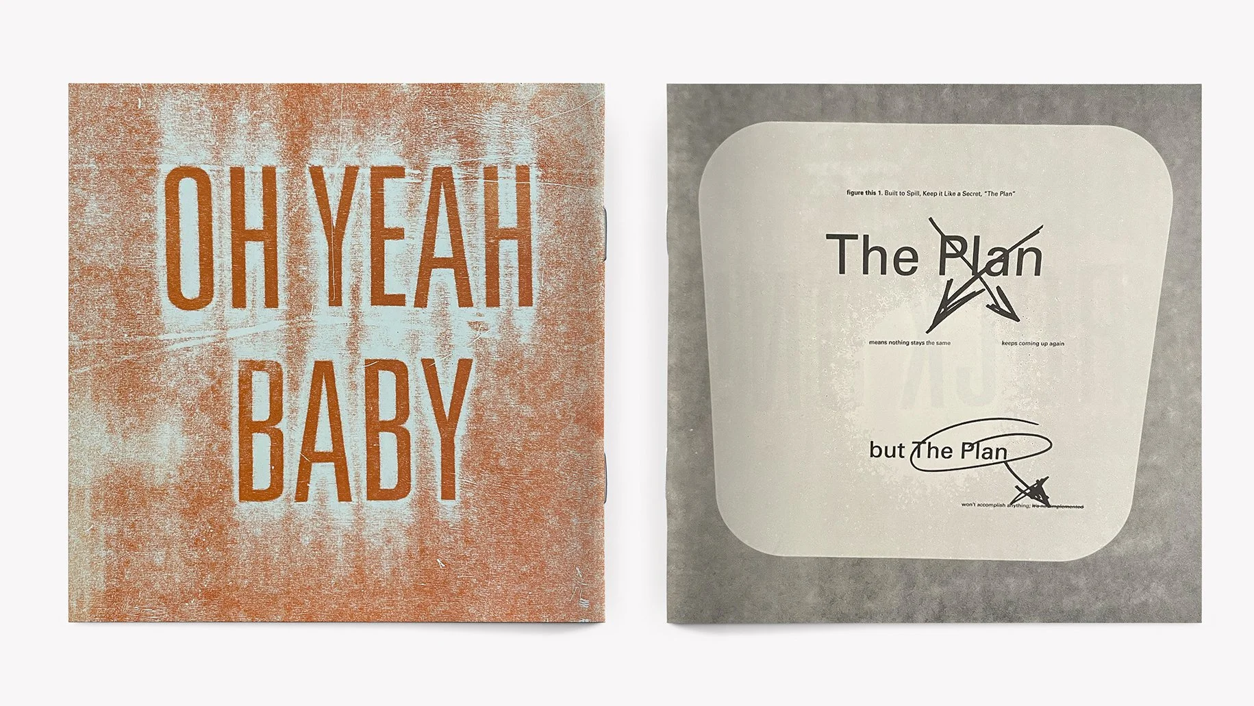
The design duo decided to select trite and often overused pop lyrics to contrast with more meaningful and poignant lyrics. Each spread of the LP sized booklets would present the two differing lyric styles, one in garish secondary colors, the other in pure black and white. The designs would be printed in 12 inch square format, and packed in a sleeve like a record.


While the designs were completed in 1999, the actual printing and production was not finished until 2003. The final edition of 50 letterpress printed and hand assembled copies consisted of four 12 inch square booklets, saddle stitched and inserted into a clear mylar record jacket that slid into a black record-style sleeve, printed with metallic silver.


Letterpress printing techniques included: metal and wood type, polymer plates, “stratagraphs” (using paper letters under the print page and a flat wooden inking plate) and an actual vinyl record as the printing surface.


The final product was met with acclaim in the design community. Lo/Fi won design awards and was featured in the One Show, Communication Arts, the Type Directors Club publication.
Creative Direction & Design: R. Michael Hendrix, Paul Rustand; Writing: Various attributed artists.